thunderpot:hamsternamedmarinette: thunderpot: ixnineeyedoracle9:thunderpot:I’ll be there w
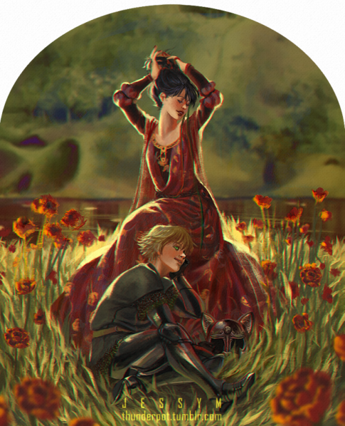
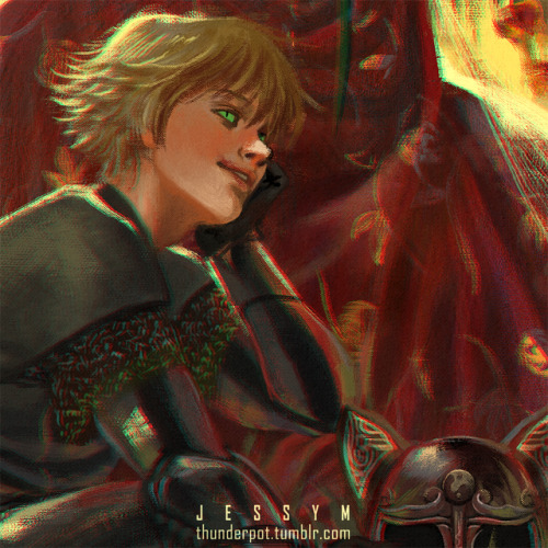
thunderpot:hamsternamedmarinette: thunderpot: ixnineeyedoracle9: thunderpot: I’ll be there when the world stops turning I’ll be there when the storm is throughIn the end I want to be standingAt the beginningWith you Zooming in on the light in this photo is tripping me out because I have been obsessing over what exact color or mix of colors I can use to portray an ultra-bright white light. Because white doesnt quite do it and when I stare at a bright light it looks like yellow, green, and blue to me. I zoomed in on this and the “light” in this picture is actually green, yellow, and red. :o!!!!!!!!! Glad it was interesting somehow! But since you said you’ve been wanting to do it.. Unsolicited tip? Just white doesn’t cut it cause white is actually the result of all other colors combined, so to portray it you need to imply these other colors. A general rule of thumb is that 2 colors will do the trick: The color you want your light to reflect, aka your object color [that I wrote major below because I’m stupid lmao] and a receding color - that is, the color the light will get as it interacts with the environment around the object. This second color usually fades out and enhances the “super bright-MY EEEYES” effect. this little tip comes from light diffraction, which creates that rainbow-like effect and is something easily observable on the readable side of a CD, for example! ^this is from another painting with a very bright light and some diffraction going on~ You need colors in the background [the darker, the better] to have this work out the best! Bonus observation: The sorta trippy effect you get in this post’s painting is because the green and red are being used to create a chromatic aberration - an effect that happens when the lens of a camera, for example, fail to focus all colors to the same point. Quite neat! I don’t think I reblogged this back when I first saw it– I think I just saved it to refer to the drawing tip later– but I will reblog it now to share this beautiful drawing and to tell OP and others how much this simple tip for drawing light has changed my year. About a year and a half ago I was scrolling through Tumblr. I came across this drawing and the tip OP added in a reblog. I saved it with the intent of trying it out and seeing if I could draw something and really make it look like light. A while after that, I started a new drawing and decided it was the perfect time to employ this new tip I found. It worked, and it came out really nice looking, and I was very happy with the result. A while after that, in January of this year, I was leaving class one day and noticed a poster advertising a student art competition for figurative artwork. I decided to submit the drawing I’d done using @thunderpot’s drawing tip, because it was good. I submitted it, kind of forgot about it, then received an email months later that I had been chosen as a finalist for this competition (which was a MUCH more prestigious competition than I had realized when I entered). And when I spoke with the judges– all of whom were big name artists and curators from places like the Met, the MoMA, the National Gallery of Art, The Guggenheim, etc– they all raved about how I had drawn the light in particular. So yeah, @thunderpot, this unsolicited art tip you gave to an enthusiastic Tumblr user over a year ago (maybe more? I didn’t check the date of the reblog) is Met/MoMA/NGA/Guggenheim-approved. It directly led to another enthusiastic Tumblr user seeing a drawing of hers on display in a gallery in New York City. And for that I thank you very much. OH MY GOD I GOT CHILLS! I’M SO HAPPY FOR YOU, CONGRATULATIONS ON THE COMPETITION AND ON THE GALLERY, THIS IS A GREAT ACHIEVEMENT!!WAAAA my heart is so full right now, thank you so much for sharing this!! -- source link
Tumblr Blog : thunderpot.tumblr.com


