thedsgnblog: Branding & Packaging for Kencko by Love Street Studio “Kencko is a brand
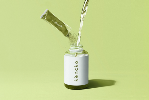
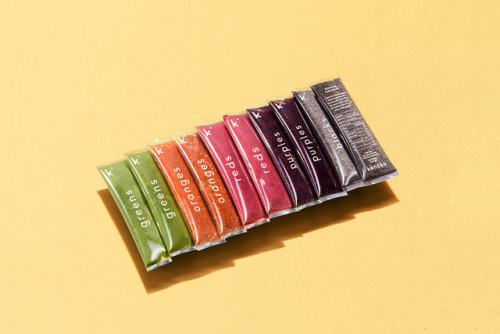
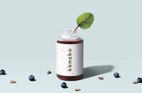
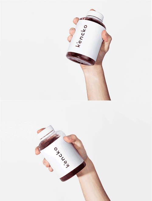
thedsgnblog: Branding & Packaging for Kencko by Love Street Studio “Kencko is a brand devoted to reinvent convenient organic fruit & vegetables products. It means healthy in Japanese, so we developed an identity where the letter K is inspired by its japanese character (Kenkó - 健康 ). The logo looks to emphasise the organic powder that defines the final product. The chromatic universe came from the authentic ingredients.” Love St. Studio is a multi-disciplinary design studio, “born” in Barcelona and based in Lisbon since 2009. They are Joana & Carmo graphic designers from Lisbon, devoted to branding, editorial, packaging, web… and whatever new challenge you´re willing to give them. T D B: instagram • twitter • facebook • newsletter • pinterest -- source link
Tumblr Blog : thedsgnblog.com
