I wish this was a little bit slower, but this gif is really neat. This is a simulation of how an ear
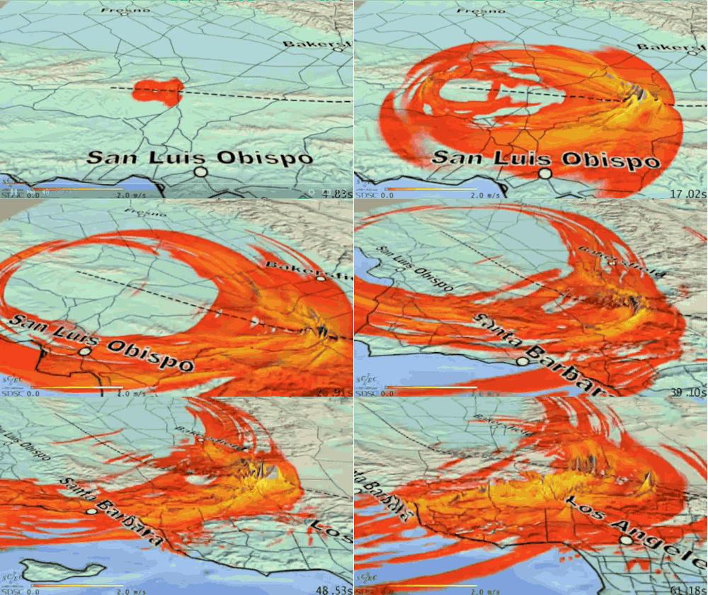
I wish this was a little bit slower, but this gif is really neat. This is a simulation of how an earthquake would propagate along the San Andreas fault if it began in the central segment and passed all the way to the southern segment. The colors and the height of the lines show intensity of shaking. Note how you can see the rupture as it moves - the highest peaks follow the fault (dashed line) directly, but they vary in intensity as the fault strength changes. Then look at how the colors change with each pass - the central valley doesn’t get that much of a shake but by the time things get to the mountains near L.A. the intensity has built. Finally, note how important the direction of the quake is - much more energy transmitted in the direction the quake moves than away from it. This rupture moves to the south so the south feels more intense shaking than San Fran.Image credit. -- source link
Tumblr Blog : the-earth-story.com
#science#geology#california#earthquake#quake#los angeles#san andreas#magnitude#mountain#simulation
