Decided to jump on the TSP character design train! Some elements of these designs are probably recog
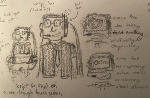
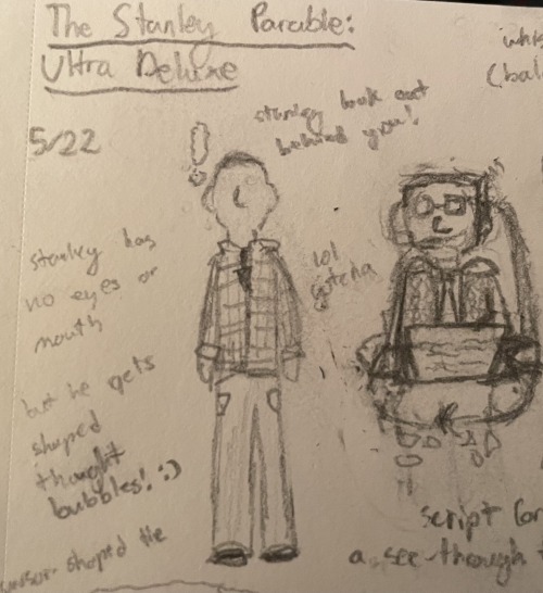
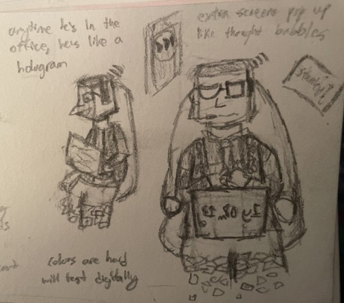
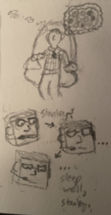
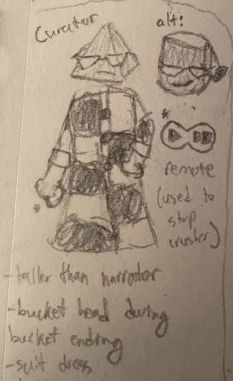
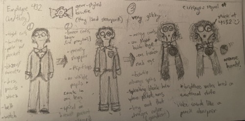
Decided to jump on the TSP character design train! Some elements of these designs are probably recognizably borrowed from some of y’all’s fantastic ones. Click on the images to see them in full and in better quality. That being said, there are detailed explanations of the designs below the cut, so don’t strain yourself trying to read my terrible handwriting.StanleyBasically just canon Stanley, other than the cursor/arrow shaped tie.Oh, and he doesn’t have eyes or a mouth. Instead, he emotes via visible thought bubbles! Usually either just an exclamation mark or question mark, but visuals or more complicated ideas will appear in a screen-shaped one (as seen in the doodle where he’s napping in the Narrator’s chair and dreaming of button heaven).NarratorSettling on a Narrator design is Hard, y’all. I knew I wanted to some combo of the “just an old white British guy” concept and the eldritch or object head concepts, but that’s easier said then done. I started by just drawing him as A Guy with a squareish head, whispy hair, glasses (are there any glasses-less Narrator designs?), a radio and mic, a sweater vest over a dress shirt, and a (yellow or red, currently undecided) tie. I used 8s for the sweater vest pattern cause I feel like it looks normal enough from a distance while still being a reference. The shirt pattern (squares of alternating lighter and darker grey (or brown?)) and the literal cube head were both inspired by the same thing: the NPCs from The Beginner’s Guide! TBC, the cube head is almost entirely an aesthetic reference - he only has a face on one side, rather than spinning it around to show faces with different emotions or anything.That being said, I did want to have the Narrator’s face do funky things. For one, his mouth is meant to be almost always connected to the mic, as if coming out of it (which would also probably means it hovers a bit in front of his face), and look a bit fuzzier (in a static way) compared to the rest of his features.Second, and more significantly, his glasses have one frame shaped like a circle and one shaped like a square to reflect to reflect his two other face/head “modes”: Camera Mode and Monitor Mode. He takes on Camera Mode when either looking at/for something that’s hard for him to see/find (often in a desperate manner), or when staring down something/someone (usually Stanley) for emphasis. Similarly, he takes on Monitor Mode when emphasizing a certain word/phrase or to mirror a relevant visual element, like the timer in the countdown ending. In both modes, the strong emotions triggering them cause his form to destabilize, his head disconnecting from his body (hence the line on his neck) and becoming less defined around the edges. His mouth takes up the space between the head and neck, which gives it more room to emote.The whole idea for the Narrator sitting in a hovering chair came from me wanting to do something interesting with the lower half of his body but not having any ideas. I considered doing what I do with my Narrator!Chara UT design - floating above the ground with the legs dissolving / fading out below the knee - but for whatever reason that didn’t feel right for this guy. Then I had the mental image of this guy just sitting in a chair Wall-E-style with his legs breaking down into pixels as they hung off the edge, and it felt perfect for him. This man absolutely would do his job from a nice looking but also super comfy leather chair without ever getting up if he could, and, in my world, he can.The last major element of the design is the see through touch screen he has hovering where a laptop screen would be. It usually has either a script or a map of the Office / story paths on it. I imagine his script is kept in multiple documents, and the sound of rustling papers that we hear occasionally in-game is the sound effect he programmed in for when he’s sorting through them on his not well organized “desktop” (”for authenticity’s sake, Stanley”). He can adjust the size and position of the screen to a certain extent, and, occasionally, other screens will pop up around his head. Like Stanley’s thought bubbles! :)One extra thing that applies to the whole design but is hard to convey with just a number 2 pencil: the Narrator never (at most, rarely) looks like he’s truly in the space. Instead, he looks more like a hologram; semi-transparent and kind of flat, with a bit of tearing around the edges.CuratorOnce I was happy with my Narrator design, this one came to me with hardly an extra thought. A button-up formal dress just fits her vibe. The black and white color scheme also feels right with the aesthetic of the museum in mind, and the pattern is meant to resemble the Narrator’s shirt. I knew she was gonna have a shape head like him, and my brain just instantly went to a triangle/pyramid for whatever reason. Then it went “but what if it was a bucket for the bucket ending”, and, I mean, how I could not do that?Other small things:I feel like she would care less about appearing appealingly/relatably human, which is why she doesn’t have a face other than her mouth and librarian glasses.She’s taller than the Narrator, even if he were to get out of his chair and float on his own like she does. It is a fundamental law of the universe.I wanted to give her something to hold, so she has an infinity-symbol-shaped remote which is what she uses to temporarily save Stanley during her endings.Employee 432 / Settings PersonAnd now we’re back to the complicated ones. I did three drawings of 432 (who goes by he/they for my purposes) to show their progression. The one thing that’s consistent across all three is his bowtie, which has a gear-shaped pin on the center knot. Out of character, the gear is a thematic tie to the idea of keeping the wheel turning. In character? We’ll say they’re a steampunk fan, why not?The first one is from when they started at the Office, at which point I like to imagine him as being an aspiring worker bee. Like, it’s his first job like this and he really wants to appear professional, to apply himself wholeheartedly (more than an office job like this deserves) and be a team player, following orders without question.The perfect candidate for the experiment.So, they wear a blazer/sweater over a polo shirt, dress pants and shoes, a belt, bowtie, and watch, with round glasses and a well kept head of curls. Though usually unseen, there’s a breast pocket on the polo shirt with a spiral pattern on it. I might add a pattern to the blazer/sweater or the shirt to add a bit more to the design, still thinking on how to go about it.The second one is him years later, struggling internally with a) the sinking feeling that this job doesn’t actually care about him, that his task is a bullshit one, and b) the obsessive hope that, any day now, things could change and he’ll be rewarded for his perseverance.So, he still wears his blazer/sweater and polo shirt to work, but he won’t button the blazer/sweater, and he won’t fix it when it inevitably slips off his shoulder. They wear cuffed jeans to work now, but a nice pair. They still have their bowtie, belt, and watch, but they don’t bother to put on any shoes nicer than flip-flops or slippers. They wear their longer hair in a ponytail rather than getting it cut, but they also got their ears pierced at some point (even he doesn’t remember).Perhaps most concerning, one of his glasses’ lenses is severely cracked, and no one can see his eyes through either lens.Not that anyone ever bothers to look.Finally, the third design is 432 post “disappearing” and becoming Settings Person. Their body is mostly gone and the remaining elements of their form are all very glitchy. They’re also like 95% flat, basically 2D.His curls are loose and messy with lots of volume and a few streaks of grey/white. His nose is gone and his mouth is replaced by a small black hole that makes pencil sharpener noises when he speaks. One eye has basically become a lightbulb, its brightness depending on their emotional state. The other is a broken clock, initially stuck at 4:32, then at whatever time you last set the in-game clock to.His bowtie remains, now constantly rotating (gotta keep that wheel turning). He also has new earrings, which are whatever sequel number the game is currently on. Where their spiral-adorned polo pocket was, there’s now a spiraling black hole. The only other clothes item still represented in some form is their blazer/sweater, now a long sleeveless “coat” (really just two strips of fabric) that change color on a gradient.The last element of their design featured in those doodles is their disconnected hands (think Gaster, fellow UT fans). Usually he only bothers to have one active, but he can have up to eight. By default they appear as computer mice, but he can look like almost any other tool, like a wrench, or screwdriver, or pen.Not a pencil, though.An extra feature I came up with while typing all this: 432 can make touch-sensitive screens like the Narrator can, but only in two sizes: small (as in just a bit bigger than their eye) or large (the size of the game screen). In order to display anything on a large screen, he needs to have a small screen with the visuals he wants displayed on it hover right in front of his lightbulb eye. Basically, he makes himself into a projector.This is how they make all the screens with sliders! :)And that’s everybody! These designs are all subject to change, especially once I draw them up digitally and mess around with color schemes. Might post the results of that in the next few days.If you enjoy my Stanley Parable thoughts, consider checking out this analysis post I worked very hard on :) -- source link
Tumblr Blog : agentravensong.tumblr.com
#tspud spoilers
