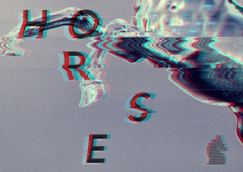
dangerhorsedesign:For the launch of our studio we wanted a promotional flyer to hand out. We wanted
dangerhorsedesign:For the launch of our studio we wanted a promotional flyer to hand out. We wanted it to be edgy and eye catching so we decided to try our hands at some glitch art. It was a challenge making sure we didn’t over-do the glitch effect and end up with a messy image, but we think we hit the mark and found a good balance. All in all we are super happy with how this project turned out!Check it out on our Behance here! -- source link
Tumblr Blog : dangerhorsedesign.tumblr.com


