Play Time by Jacques Tati (1967) I was wasting time on Tumblr yesterday when I stumbled upon a post
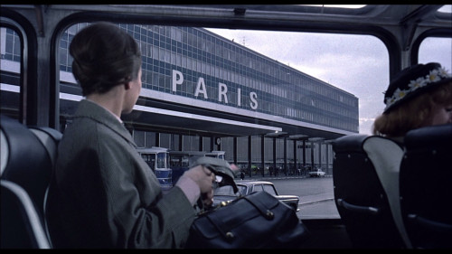
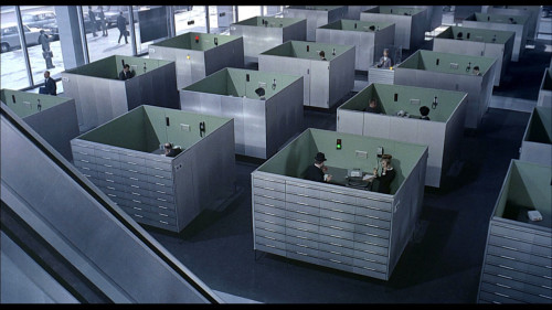
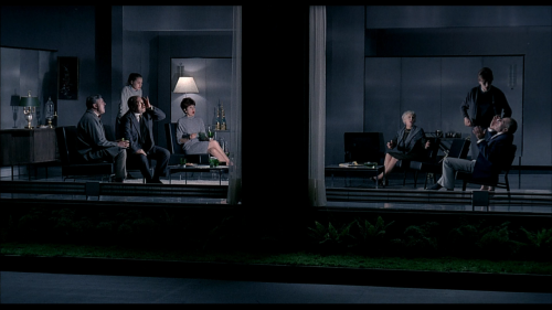
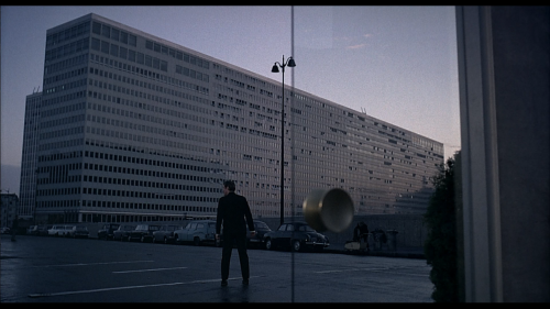
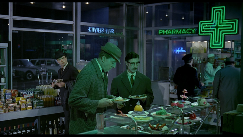
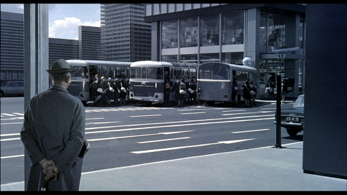
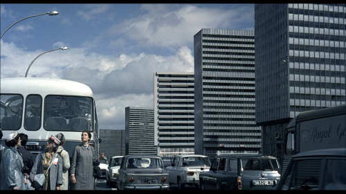
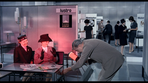
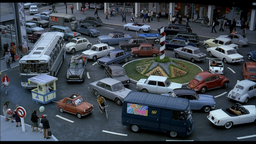
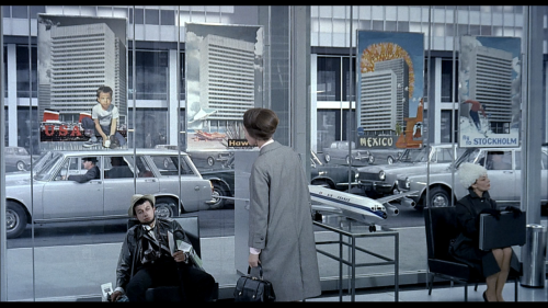
Play Time by Jacques Tati (1967) I was wasting time on Tumblr yesterday when I stumbled upon a post by “whenwewerecool”, showing stills from Jacques Tati’s Play Time. I was 7 years old when I first saw this movie and I have not seen it ever since. I remember the images vividly though, and looking at a few of them again yesterday compelled me to do this post. Tati was a genius in many ways. If you haven’t had the chance to see his work, both Play Time and Mr. Hulot’s Holiday are available on Netflix instant. I chose a few stills from the film to show you. As you can see - and as Radiohead would sing - “everything (is) in its right place”. One last thing, I was reading about his unique style on his wikipedia page and I thought I’d share a few sentences with you. Tati wanted the film to be in color but look like it was filmed in black and white; an effect he had previously employed to some extent in Mon Oncle. Predominant colors are in shades of grey, blue, black, and greyish white. Green and red are used as occasional accent colors: for example, the greenish hue of patrons lit by a neon sign in a sterile and modern lunch counter, or the flashing red light on an office intercom. It has been said that Tati had one red item in every shot. Enjoy, and make sure you follow whenwewerecool! For more screenshots of the film, click here. -- source link
Tumblr Blog : kodakism.tumblr.com
#whenwewerecool#jacques tati#play time
