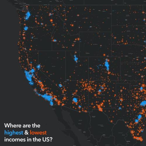
mapsontheweb: Households within high ($200,000 or more, blue) and low (less than $25,000, orange) an
mapsontheweb: Households within high ($200,000 or more, blue) and low (less than $25,000, orange) annual income ranges. The data shown is household income in the past 12 months. These are the American Community Survey (ACS) most current 5-year estimates: Table B19001. The data layer is updated annually, so this map always shows the most current values from the U.S. Census Bureau. To find the layer used in this map and see the full metadata, visit -- source link
Tumblr Blog : mapsontheweb.zoom-maps.com
#oh interesting#geography#income inequality


