joganpie:gondalsqueen:joganpie:gondalsqueen:mlmanakin:Mandalorian art seen in The Clone Wars and Reb
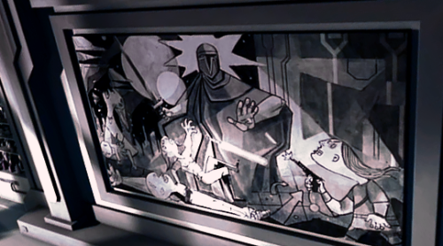
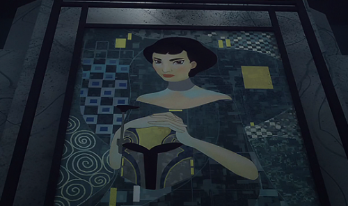
joganpie:gondalsqueen:joganpie:gondalsqueen:mlmanakin:Mandalorian art seen in The Clone Wars and Rebels.We need to talk about the fact that Ursa Wren’s portrait painter is Gustav Klimt, and that apparently all other Mandalorian art is Guernica, which is…stridently anti-war. The middle one is definitely a Guernica remix and here’s a clip of Filoni talking about that.The second-to-bottom one though is a remix of Picasso’s “Massacre in Korea.” (Which in turn is probably a remix on Goya’s “The Third of May”) But yeah, more anti-war content.I can’t quite pin the second-to-top mural though and it bothers me. (And I hate that I thought this sentence but “it looks more like a Neoclassical composition and subject than that of Picasso-style cubism, or may be drawing influences from Greek friezes.”)Filoni clearly loves this sort of thing though, and honestly I kind of love it too because it enriches the worldbuilding to show a culture’s art and it can say a lot to use things like this as shorthand without saying anything aloud at all. (The anti-war themes for the pacifist New Mandalorians, the Wren clan having a different style, the noseship art on clone ships, etc. There’s also a whole side tangent we could go on about Mandalorian clothing and architecture.)Oh, I know what you mean about that second one! My first thought was something like The Lapiths and the Centaurs (classical, not Neoclassical, I know), but that was just because of the angles of the figures and the general shape of the composition. It’s not quite right, in other words. And then you’ve got those Mandalorian helmets that always make me think of Romans, even though there’s no purposeful connection here. And this is where my knowledge gets a little skimpy. The simple lines and gemetric shapes did make me think of modernism, a la Picasso, but maybe it’s more…art deco than that? I know art deco isn’t really right, but I’m thinking of something from that time period. Well, the second painting still has the Guernica-styled faces of the victims and the same starburst motif as the other one, so they’re obviously still sticking with that theme.But yeah, the very posed triad sort-of composition makes it seem more classical (Neo or old school) like that exact sort of frieze, and it’s a good comparison. (Also, the severed head + sword combination always sends me immediately into a Perseus art direction.)There is definitely Art Deco influence on New Mando style, and the Mandalorian gave us the Armorer with the even less subtle Greek helmet, so we’re definitely mixing styles here. And it may just be their own design which is why it doesn’t feel quite right period-wise. -- source link
Tumblr Blog : mlmanakin.tumblr.com


