momoryou:hydropis:You know, at some point I graded first year graphic design students. Graphic desig
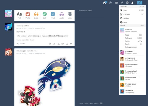
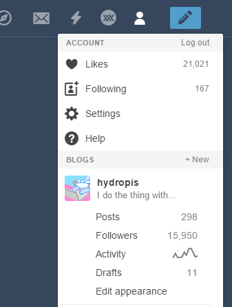
momoryou:hydropis:You know, at some point I graded first year graphic design students. Graphic designers generally design print media so their websites are absolute trash. At least at that college they were trash. I learnt from them for a year, I know how bad their sites are. They don’t understand grids and usability. Usability being how logical a website is and how user friendly it is.At some point I had to grade a kid who had comic sans all over his website, black borders everywhere and neon colours with clip art to spice it all up. But every thing was still clear. The font was chosen to be easier to read, the buttons were all located in an easy to spot place and overall I didn’t have issues navigating his absolutely horrible looking website.Right now, I believe that the kid that made that horrendous website as a first year graphic design student, would still be able to put together a more logical layout design for Tumblr than anyone over at Tumblr could ever do.I don’t complain easily about changes in websites because I know 99% of the time they’re actually for the better. That’s my semi-professional opinion. It’s been a while since I worked at a webdesign/development agency and I kind of changed what I do over time.But this?This is absolute shit. -- source link
Tumblr Blog : anue.tumblr.com
#agreed#tumblr#irksome things#dashboard#enough already#design

