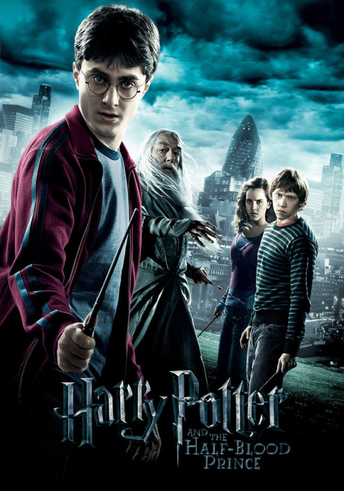
the-06:movie–posters:The Harry Potter franchise is kind of interesting because it never really had a
the-06:movie–posters:The Harry Potter franchise is kind of interesting because it never really had a uniform aesthetic style. This is most likely because of director and crew changes over the course of the series but is interesting because the first two films have a very medieval look to them with everything appearing very old and with adult wizards wearing flowing robes and grander costumes than the later films which have a Victorian tint to them in terms of style and costuming. I think another reason for the differences is the time span, the movies were filmed over the course of years and so were bound to be influenced by real life fashion. My favorite was the Prisoner of Azkaban which had lots of little magic going on in the backgrounds and to me felt very magical. The film is the jumping point between the original look and the new look that comes to fully be what it is in the fifth movie. Moving away from ancient and medieval the design takes on a more modern style and looks to me very Victorian and perhaps a little 1940′s at times. The design also makes the later films seem sleeker and more urban fantasy. The changes in the third and fourth are less dramatic than in the fifth which also makes use of light tinting a lot more. It’s interesting that such a huge franchise never set a visual tone and later directors were just able to pick and choose what they wanted everything to look like with only a few things being truly fixed in place. Plus, hand-illustrated posters (the HP1 poster was done by the legendary Drew Struzan) were already on the decline by the arrival of the 2000s. I didn’t care for the Deathly Hallows pt. 2 ones, with “HP7″ just lazily slapped on there. -- source link
Tumblr Blog : movie--posters.tumblr.com


