Alice: Madness Returns Calendar TemplatesHello everyone! I realize I’ve been absent for quite
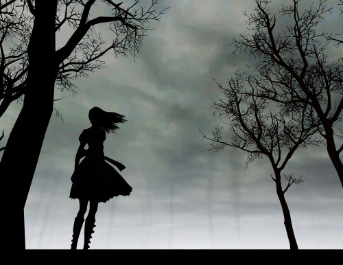
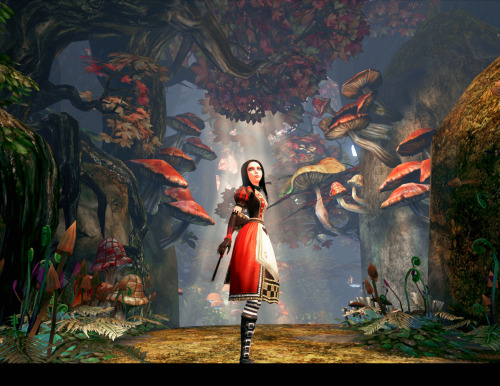
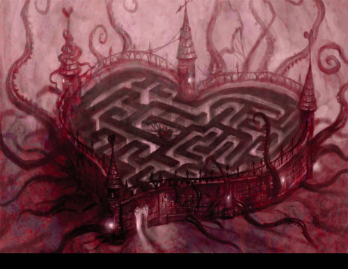
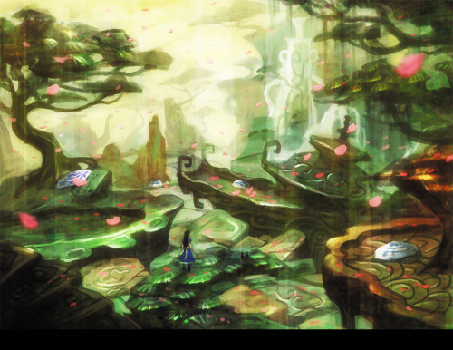
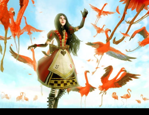
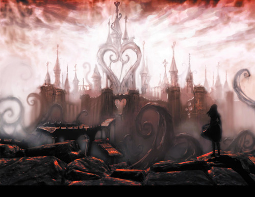
Alice: Madness Returns Calendar TemplatesHello everyone! I realize I’ve been absent for quite some time. During that time, however, I’ve made myself a calendar - from AMR art, of course! And I thought maybe some other people would enjoy it too. Over the next few days, I’ll be posting the remaining images, as well as some supplementary stuff - what I did to label the images by month, and some of the actual calendar grid pages.Basically, with a little bit of assembly, a photo editing program, a printer, and some paper, you’re all set to make a calendar.To be clear: the way I created my calendar was very DIY. I’ll list the kinds of paper I used and how I put it together (because I think it looks gorgeous, despite being held together by an old 3-ring binder), but this is by no means a definitive guide.So, to the images!All of these pictures are sized to fit 8.5 x 11" paper (including the black stripe on the bottom). I did quite a bit of stretching and cropping to get these images to this size, so if you have paper with slightly different dimensions, I guarantee you can re-size the images on your computer without making them look warped. You may notice that some pictures look sharper than others, and you would be right. The top right picture with the cat, for instance, was simply low res to begin with. I tried to find the best quality versions of each image, but in some cases that still wasn’t very impressive. I did my best to sharpen them. Someone with better photoshop skills than I might be able to tweak them some more.The black bar at the bottom of each image is for the binding rings. Like I said, my method wasn’t exactly high-tech; I used a 3-hole puncher at the bottom of each page. Again, if this bothers you, you can stretch the picture without making it look too different.I put the name of each month in the bottom center of the image, in the Supernatural font, on top of an image from the AMR art book. An example:I’ll post this image in a blank .png form in a following post.Other fonts I can recommend are here (“The Last Font I’m Wasting on You” and “Anywhere” are the ones I use for the tarot cards).Obviously, I do not own any of these images. I just put them in photoshop, edited them, and re-sized them. The edited images are usually much more vibrant than the originals, and more balanced, so they stand on their own. My favorite image is the ship in the bottle - my printer and paper went above and beyond my expectations, and the final product looks just like the image - for once.More images to follow soon, as well as supplemental stuff and things!Credit for the second image [x] -- source link
Tumblr Blog : alicemadnessreturnstarot.tumblr.com
#american mcgee#alice liddell#deluded depths#queensland#infernal train#old posts
