typeworship: Between: One font, three waysMonotype have launched a new typeface with three distinct
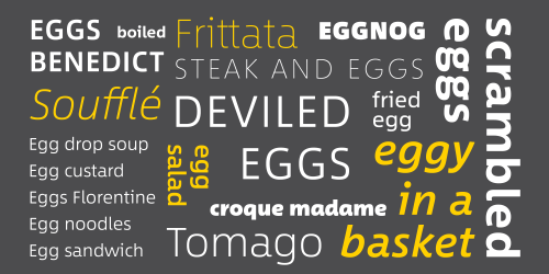
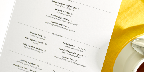
typeworship: Between: One font, three waysMonotype have launched a new typeface with three distinct states in one family. This innovative approach to how the font operates came from discussions between its designer, Akira Kobayashi, and fellow Monotype designer Nadine Chahine. The idea for a family with different “energy levels” emerged. Between™ centres around humanist and rounded sans serif designs to offer a typeface that can fluidly transition between three different states as the context demands, seamlessly switching from technical and modern to crisp and highly legible and into warm and friendly:Between 1 is the most modern, fusing industrial and humanistic san serif styles. Between 2 comprises natural-looking letterforms that strike a balance between crisp legibility and friendliness. Between 3 offers a lively, handwritten look – a freestyle sans serif with an uplifting, youthful and dynamic feel.All three designs share the same cap height and x-height and have letterforms in common – establishing a clear family relationship between them. However, certain characters such as ‘e’ and ‘g’ both demonstrate the unique characteristics of each font in the family, and embody the differences between them.The EggThe specimen uses the culinary comparison as a starting point, taking the egg as a visual motif and way of representing the contrasting character of each of the fonts. Typographically speaking, the word egg also offers a chance to show off the different faces of the design, which are highlighted in the comparison between gs.The design has been tailored to the kinds of brands people see and interact with every day, particularly food, entertainment, sport and fashion – all of which require approachable typographic voices, and greater versatility when it comes to font combinations. Combining Fonts with BetweenKobayashi suggests that the geometric personality of Between 1 could be useful for technology brands in need of a more human personality, while Between 3’s organic appearance might work well for artisan brands and natural products. He also recommends typeface companions, with Eurostile and Verdana working well with Between 1, Neue Frutiger or Avenir Next with Between 2, and designs with rounded stroke endings, such as Akko Rounded or DIN Next Rounded, for Between 3. “A lot of worldwide corporations and brands have started to use rounded or humanist sans, instead of cool and steady Helvetica,” concludes Kobayashi. “I think ‘approachable’ is one of the keywords which describes the trend. Between is my attempt to fuse coolness and warmth.” Akira Kobayashi.Take a closer look here. -- source link
Tumblr Blog : blog.8faces.com


