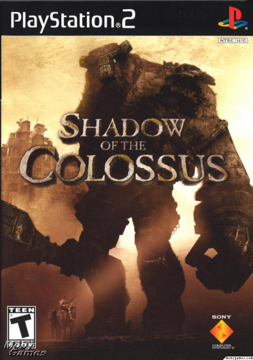
Ever since seeing space on the syllabus as a design element I immediately thought of the cover art f
Ever since seeing space on the syllabus as a design element I immediately thought of the cover art for both Shadow of the Colossus and Ico. Both covers use scale to develope space in their respective scenes. SotC has a smaller character a little bit in front of a large dark giant figure, which in turn is in front of an even larger castle. Ico does the same thing with buildings and shadow. the repetition of the light and shadow across the arches opens up the space, instead of it being solid the pattern is then connected/ continued with the building in the back, while the focal characters are put in the middle of the space to be focused on. P.S. The Ico eu/jp cover art is a homage to Nostalgia of the Infinite by Giorgio de Chirico -- source link
Tumblr Blog : 2dconnor-blog.tumblr.com
#team ico#fumito ueda#metaphysical painting

