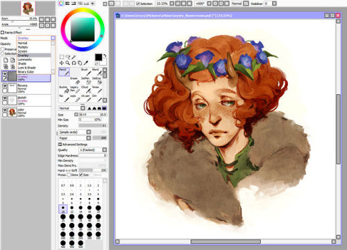
lexxercise: I’ve been getting a lot of asks lately about the brushes and textures I use in my work,
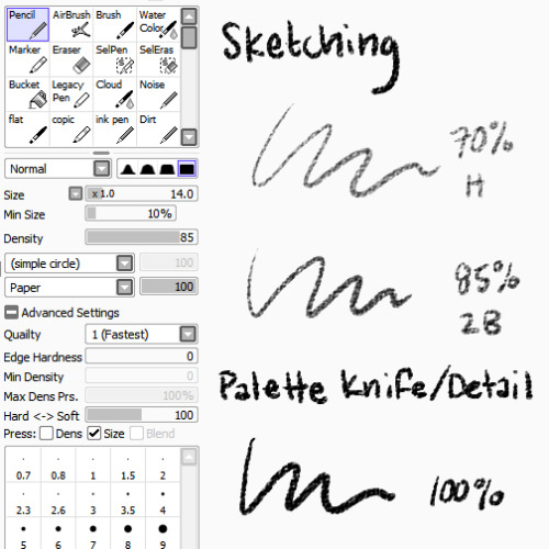
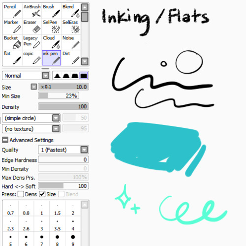
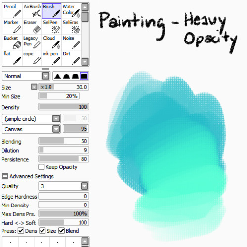
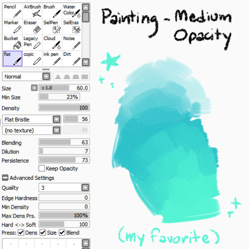
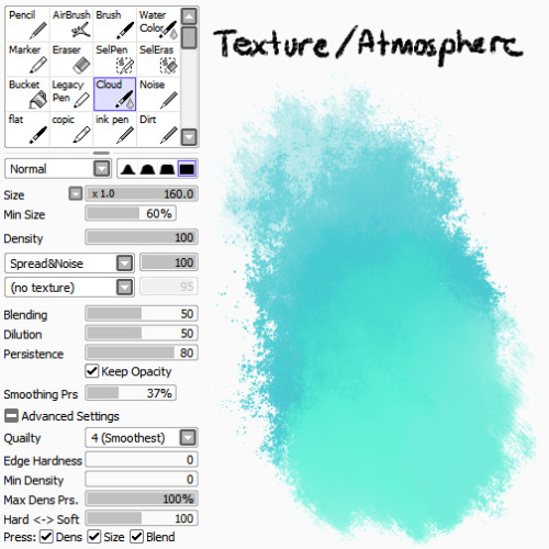
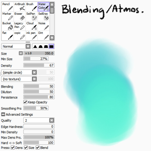
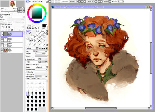
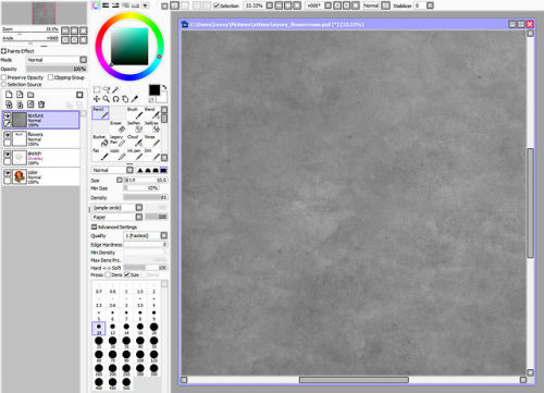
lexxercise: I’ve been getting a lot of asks lately about the brushes and textures I use in my work, so here’s a BIG FAT REFERENCE POST for those of you who were curious! Bear in mind that I’m really lazy and don’t know what half the settings do, so don’t be afraid to experiment to figure out what works best for you :> BRUSHES PencilI use the pencil tool with SAI’s native paper texture both for sketching and for applying opaque color with no blending. Lower opacities give it the feel of different pencil hardnesses, while full opacity makes it more like a palette knife, laying down hard-edged, heavy color for detail work or eventual blending with other brushes.Ink PenMostly made this because I’m lazy and I didn’t want to have to keep turning my textures off/opacity up when I wanted to ink something (even though I don’t do it very often), or lay down flat colors. I find the line quality to be much more crisp than Photoshop, and you can manually adjust in-program stabilization to help smooth out hand wobbles.Round BrushThe plain ol’ brush tool acts as sort of an in-between for me in terms of brush flow. It’s heavier than my usual workhorse brush, for faster color application and rough blending, but not as heavy as the pencil tool, which has no blending at all. I like to use the canvas texture on this brush to help break up the unnatural smoothness that usually accompanies digital brushes, but it works just fine without.Flat BrushA brush tool set to flat bristle is by far my favorite to paint with. I don’t use any textures with it because I think the shape of the brush provides enough of that by itself. I use it for everything from rough washes to more refined shaping and polish. It’s just GREAT. WatercolorBest used for smooth blending, washes, gradients, and smoky atmospheric effects.CloudBasically a grittier version of the watercolor tool, because too much smoothness weird me out. Good for clouds and fog, as the name suggests, or just less boring gradient fills. TEXTURE OVERLAY To further stave off the artificially smooth look of digital painting, I almost always overlay some sort of paper texture, and it’s almost always this one, which I scanned and edited myself. You’re all welcome to use it, no permission required! Using overlays in SAI is just as easy as using them in Photoshop. Just paste the texture into its own layer above everything you want it to apply to, and change the layer mode to Overlay. That’s it! Want a more prominent texture? Up the contrast. Something more subtle? Lower the contrast or reduce the layer opacity. You can also use a tinted overlay to adjust the overall palette and bring a little more color unity to an otherwise disparate piece! Just be aware that too much texture can hurt the readability of the work beneath it, so I’d err on the side of subtlety. Hope that helps! -L -- source link
#reference

