aftertouchs:hawkelahawke:Firaxis Games’ concept artist Sang Han Sang on how to give your digital
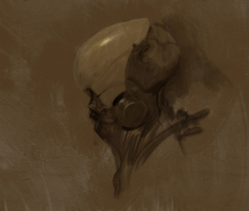
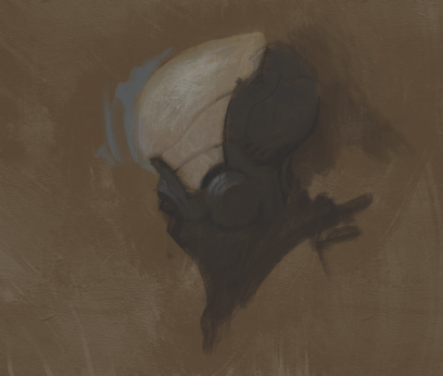
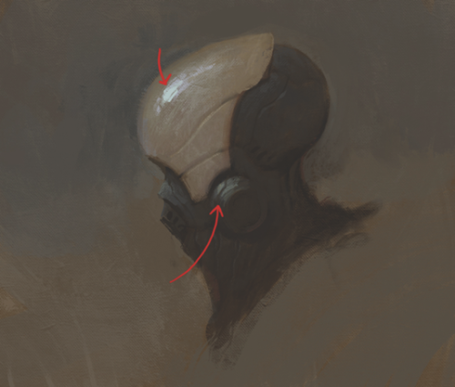
aftertouchs: hawkelahawke: Firaxis Games’ concept artist Sang Han Sang on how to give your digital art a traditional look and feel. [source] 00. BEFORE YOU BEGIN Many people have tried using brushes that simulate analogue bristles, but they may not have thought about how the paint is applied. Traditional painters take great care in applying each stroke of paint, which has been thoughtfully blended to the right colour and value on a palette. Since the digital medium is so fast and forgiving, we tend to dive right in without much thought and noodle around until something happens. I think this leads to muddy colours, and the energy of the initial gesture gets lost. 01. SKETCH IT OUT I begin with a rough sketch, trying to keep it loose and gestural. It’s difficult to think about design, colour, lighting and composition all in one pass so I break it down into steps and keep it simple at the beginning. These early steps are important because not only are they the foundation for an entire painting, but some of these strokes may show through in the finished work. 02. LAYER IT UP Here I create a new layer and change the mode to Multiply. I then paint on this layer with a colour that resembles yellow ochre or burnt sienna. This will help to gauge value and colour more easily than if it was a white canvas. I could have simply filled the layer with a flat colour, but again, the painted strokes may show through and add to the final painting. 03. RENDERING In this step, I block in the local colours and start rendering. As I do this, I try to remember not to overly blend or noodle around too much, as mentioned above. One of my goals is to retain the energy of each brush-stroke and put paint down with a sense of conviction. Sometimes I put a single stroke down, undo it and repeat this process many times until I’m satisfied. 04. LEAVE MARKS Keep in mind that you don’t have to render everything. You’ll notice in traditional paintings, certain details are kept as abstract marks. This adds another level of interest to the viewer. As you get closer to the end of the painting, lay the strokes down with lower opacity to give the effect of thicker paint. I like to do this when rendering certain accents, such as highlights. I need this like burning. -- source link


