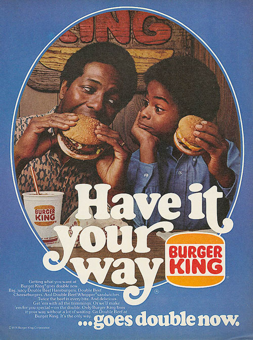
Emphasis in a Burger King Ad The main point of an advertisement is to sell a product to the consumer
Emphasis in a Burger King Ad The main point of an advertisement is to sell a product to the consumer. The easiest way to do this is to create an advertisement that focuses on the product that you wish to sell. This 1976 Burger King ad has done just that.It subliminally makes the viewer focus on the food and logo. The primary way of doing this was to create a frame to focus the viewer’s eyes on the image. a blue frame is put around the central image in order to contrast and amplify the central images main color scheme of a warmer orange. Next sight lines are established by the subjects eyes and hands that point directly to the food. Also apparent in the image are many smaller burger king logos. One above the subjects heads, one on the cub and two on the wrappers which are obscured by white text. Thus an entire image has been created that zeroes in on the burger and the expression of joy on the faces of the two subjects in an attempt to make the association that Burger King burgers taste good. Now the image continues through text to the second focal point, the logo. The Burger King logo is also a focus point because of how it is presented in the lower half of the image. The logo is put half way through a sentence, interrupting it and causing the viewer to associate “Have it Your Way” with the logo. It also helps that the orange logo is contrasted on the blue back round. -- source link
Tumblr Blog : 2dconnor-blog.tumblr.com
#burger king#advertising#emphasis
