For my brother’s birthday, I came up with this. It’s nothing really special (as far as the e-book de
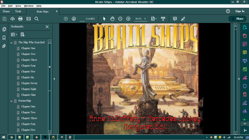
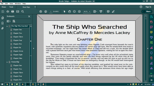
For my brother’s birthday, I came up with this. It’s nothing really special (as far as the e-book design goes; the stories are really good, and I’d recommend you go to Baen.com and take a gander at them); I’d already had practise with the computer screen design during the last project. But there are three interesting points:First, I’ve moved away from the standard page format to something shaped a tad bit more like a computer screen. Nothing technically difficult there, but it is worth nothing for the first time I’ve abandoned the usual portrait layout.Second, as you can see, there are images on the computer screen! For The Ship Who Searched, I did a courier service logo, which is described in-story as a “blue and yellow… circle-and-lightning-bolt”. Not really hard to create, obviously. I did attempt to create a white outline around the bolt, but found that the logo worked best with a blank space between the circle and bolt. For PartnerShip, I wanted an image of a hyperchip, to hint at the importance of such a device in the story. That was somewhat harder: I had to find just the right image of a computer chip, (I wound up finding a motherboard, I believe, to use as a starting point in the end) and experiment with a number of operations to get it to look just right - not too complex, or it would make the logo look too simple (which it is, but there’s not much I could do to avoid that, is there?), but not too simple, or it’d be unrecognisable. I can’t even recall how I managed it; there was a lot of playing about with colour indices and posterisation and who-knows-what-else. Still, in the end I wound up with exactly what I was going for. After I was done, it was just a matter of getting the images roughly centred on the page and correctly aligned with the screen lines.Third, Chapter Seventeen of PartnerShip has a static effect, as you can see. Not to spoil too much, but given the unique situation the characters are in during that chapter, I thought it would be a good idea to mirror that on the page. I wound up creating four variations on the original image, and cycling them just as [ERROR: SPOILER NOT FOUND]. Luckily enough, the chapter wound up having just the right number of pages! It’s surprisingly hard to do glitched and readable, but I managed that in the end - the first image of the cycle, pictured above, is the worst. I also thought about modifying the text - not the actual words, but the layout or the font; but I was working under a time constraint and felt it best to avoid experimentation for this project - and, if done poorly, such messing about would definitely hinder readability.So I guess there’s a few special things about my work on this book. And yes, looking at this now, I fully realise I misspelled Anne McCaffrey’s name on the front cover. Unfortunately, it’s too late to fix… Ah, well. In other, less typoe-ridden news, I think I may be able to crack the secret of virtual marbled paper; it may be doable with fractals… -- source link
Tumblr Blog : ex-professo.tumblr.com
#e-book#brain ships#anne mccaffrey#mercedes lackey#margaret ball


