{Stumbled upon some work by Toronto-based firm Burdifilek (new site?) - featured before on here sev
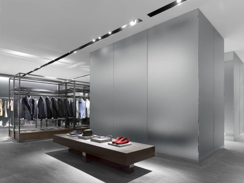
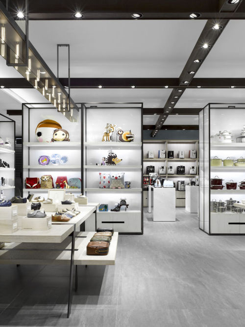
{Stumbled upon some work by Toronto-based firm Burdifilek (new site?) - featured before on here several times before…}A luxury clothing store, for many, might repel by its pretention or elaborate attempts to create Byzantine spaces and details in which the product might be all but consumed in the display. Burdifilek’s take on the men’s side of things is a study in grays and whites (with a few strong accent in black), all carefully staged with light.Good lighting recognizes the potency of shadow, the most attractive blend of light and shade to create liveliness and visual intrigue. A well-calibrated combination is interesting from afar - a draw into the store - while yet serving the object in all its luxurious detail - up close. Accent lighting permeates, like spotlights on a dimmer, to bring out each object’s texture and hue while ambient gray provides a backdrop.Gray works its way through in subtly differing textures, whether in walls of tactilely-smooth metal, or contrasted shades like brush strokes spreading the length of the floor. Yawning mouths of black seem poised to swallow bright sneakers down an ivory throat while elsewhere shoes are animated as if spectators at a fashion show - lit, it would seem, from below. A funny role reversal. In this space, a sense of narrative is unmistakable: you can’t help but notice a cheery row of plimsolls and “côte de mer” sweaters exhibited directly across from soot-black pants and thick-zippered leather jackets. So go on, take your pick. -- source link
Tumblr Blog : houseandhomme.tumblr.com
#interiors#interior design#design#toronto#burdifilek#retail design#retail interiors#masculine#masculine interiors#masculine design#modern interiors#modern design


