{Had been sharing these images not realizing that they were all in one project… and so, wante
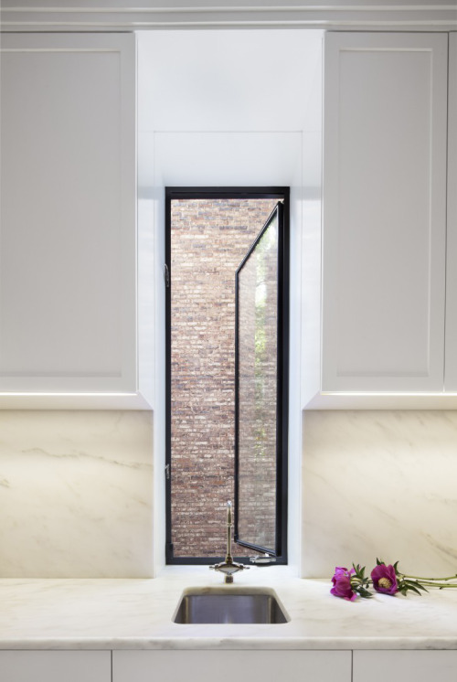
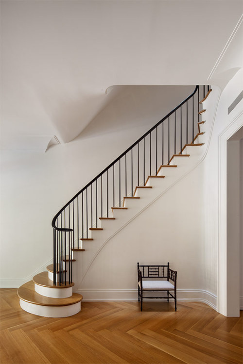
{Had been sharing these images not realizing that they were all in one project… and so, wanted to gather the other photos not in the last post to give you a better picture. Love love LOVE the restrained modernism with subtle traditional notes and proportions.} Architects Devin O’Neill and Faith Rose of O’Neill Rose Architects had their work cut our for them when they were approached to renovate a landmark Romanesque Revival in Manhattan’s Upper West Side. Originally designed by George H. Budlong in the late 1880s, the once stately townhouse had been sectioned into a series of single floor units – all but obliterating the interior’s original grace and beauty. As O’Neill put it in a recent interview, “There were something like 20 different renovations over the course of the building’s life. We wanted to recapture its elegance, but create a totally contemporary home.” The tasks at hand were two fold – there was the restoration and re-working of the building’s historic facade and then there was the interior, which O’Neill and Rose entirely gutted then built anew with a modern steel structure. For both, they referenced other historic townhouses – pulling traditional details like herringbone floors, plaster moldings and marble mantels which they then simplified / redesigned with a contemporary slant. One of the home’s pivotal new features was the staircase which the architects placed in the center of the home to allow for maximum light flow. The elegant banister, done in mahogany and bronze, was inspired by shaker design and the entire stairway was treated as a sculptural piece, which the architects continually finessed as it was built. Encompassing a total of five stories, the main house is furnished in a mix of antique, contemporary and modern – notably featuring classics like the CH37 Dining Table, Wishbone Chair, Shell Chair and Swan Chair from mid-century masters Hans J. Wegner and Arne Jacobsen. In a nod to the home’s past, skilled craftsmen were relied on heavily and elegantly minimal cornices, baseboards and trims were incorporated throughout. While the images shown suggest the home was not entirely furnished at the time of the shoot – the minimalism allows the new structure and detailing to shine – leaving you to wonder if it would be a shame to add much more. Photography by Michael Moran. via -- source link
Tumblr Blog : houseandhomme.tumblr.com
#interiors#interior design#design#architecture#transitional interiors#transitional design#new york#transitional kitchen#black mullion


