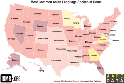
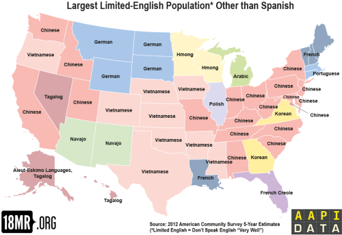
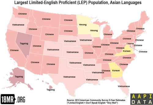
Remember that Slate.com map? Our data wizard partner in crime Karthick Ramakrishnan had a crack at t
Remember that Slate.com map? Our data wizard partner in crime Karthick Ramakrishnan had a crack at the data because he thought it looked a little fishy. He came up with the top map, which has since been replicated by another demographer. (Not 100% sure how Slate came up with their original map using the same data.)He also responded to a popular social media request for a most common Asian languages map (map #2 above). And decided to make another critical intervention: which languages are commonly spoken in households with limited English proficiency (maps 3 & 4).Tracking and mapping limited English proficiency households is in many ways more important than the feel-good language diversity of the first two maps. It can inform how we allocate resources to translation services, how we provide essential services like health care and education, how we do business, and how we live in our communities.Read more about the map fixes here. -- source link
Tumblr Blog : 18mr.tumblr.com
#languages#asian american#immigration#data#maps#nerd stuff


