alkcomics:Go into the forestUntil I can’t remember my nameI’m gonna come back and things will be dif
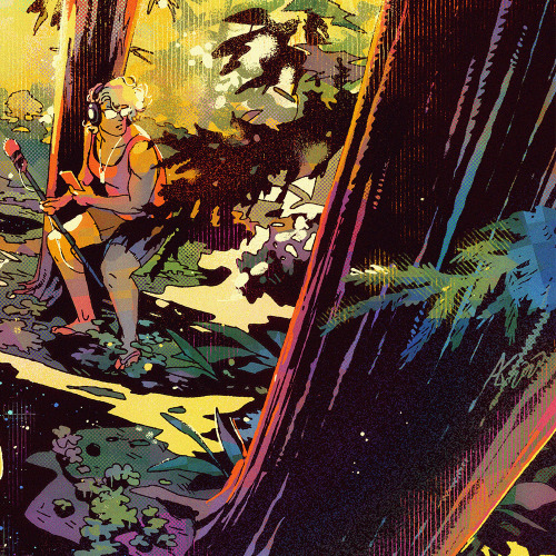
alkcomics:Go into the forestUntil I can’t remember my nameI’m gonna come back and things will be differentI’m gonna bring back some stories and gamesTrying to build some easy shape language for Santa Cruz foliage into my wrist for the backgrounds in Limiter. Had fun experimenting more with the coloring style, focusing foremost on values and rolling the dice a bit with texture. I’m not quite at the balance of controlling the chaos and letting go of the control, but I definitely learned a lot with this one.Process rambles after the cutTop is the lineart sans colors (and the top ‘whiteout’ highlights), bottom is the thumbnail sketch I started from. Lighting and color are big focuses for me right now, so I’ve started throwing color beneath my small lineart sketch both to plan better in the colors, and to plan better in the lineart. This color thumbnail is done zoomed out and at low resolution so I focus on the big picture (details and decoration don’t need that sorta’ prep work for me).I’ve been struggling recently with a satisfying execution of the colors from a satisfying color thumb. The thumbs are so loose and fast, which leads to a lot of ‘happy accidents’ with color bleeding and textures. But my full-size color process is more calculated and stiff. So finding ways to be more fluid and loose with the colors is the task. I don’t usually use layers, but I’m finding ways to layer or mask off the edges I don’t want to lose so that I can get impressionistic where ambiguity is fine.As for the lineart, I’ve been so inspired by seeing older comic inks for a while now, and seeing the graphic representations of light and texture the artists came up with. With the full colored pieces, it’s harder for me to see what’s being defined with inks and what’s like, airbrush or tone. But I follow a few comic art accounts that show originals or just inks and that’s been really instructive. This has been a long process of learning for me for quite a while now, but some of the light rendering in inks is starting to feel natural. I’m right at the cusp of confidently and consistently being able to stylize it in a way that feels mine.The next hurdle has been incorporating the two learning paths into something that achieves what I’m going for. I’ve failed a few times on the more “Frank Miller” inking I was trying out when it came to adding colors. It read well in lines, but colors lost the ambiguity that made it interesting. Keeping the color thumb open in a separate window while I’m inking sorta’ helps.I like the inks of this one by themselves, and think they stand alone fine. I was afraid that the colors wouldn’t add anything, since the inks felt complete. It didn’t quite get to the perfect balance I aspire to (like the collaborative Mike Mignola and Dave Stewart Hellboy comic art), but that fear forced me to be more experimental. I masked off a few areas I needed to preserve with solid colors, and then went hog wild with textures in the rest, suggesting dappled light and psychedelia. Again, still lots to learn, but I’m excited I finished this one.For perspective, this is a screenshot of all the other background development illustrations I’ve tried and given up on after the color thumb stage, lol. Learning, man: -- source link
Tumblr Blog : alkcomics.tumblr.com
#process


