The Life and Opinions of Tristram Shandy, Gentlemen - Visual Editions: Visual Editions’ glorio
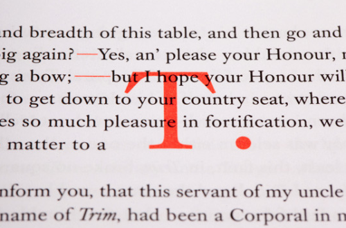
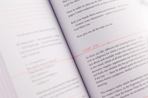
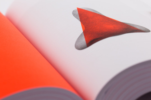
The Life and Opinions of Tristram Shandy, Gentlemen - Visual Editions: Visual Editions’ glorious 688 page editorial exploration of Tristram Shandy shows off their design talents from beginning to end. With a combination of techniques such as overprinting, spot colour and cropping, the novel has been developed far past its original visual language, and has become a vehicle for visual interaction. ‘Tristram Shandy was first published in the late 18th century in nine volumes and is still, we think, one of the best (and probably the first) examples of visual writing around. The sad thing is, though, Shandy has long been republished in cheap and nasty classic editions, so our re-imagining punks it up a bit, while still staying faithful to its original spirit. Visual Editions’ Tristram Shandy is filled with visual jokes: a closed door is illustrated by a folded page; beads of sweat by spots of varnish; and the famous “black page” replaced by two pages on which the text is over-printed in black.’ - Visual Editions This book is layout and editorial design at its best, something Visual Editions know a lot about; to see more of the book on Visual Editions’ website, click here. -- source link
Tumblr Blog : overonehundred-blog.tumblr.com
#vco652#visual communication#visual#visual editions#editorial design#editorial#book cover#reading#typography#graphic system#graphic design#design#designed#designer#layout#layout design#orange#printing#print design#colour


