Designing the Good Book - NASB Reader’s Reference: The Bible Design Blog is run by J Mark
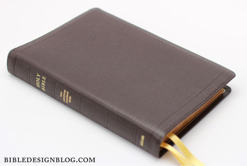
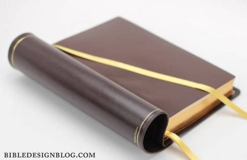
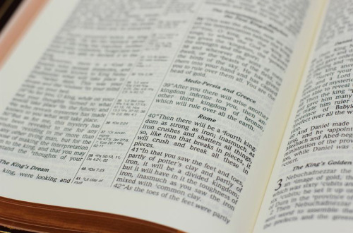
Designing the Good Book - NASB Reader’s Reference: The Bible Design Blog is run by J Mark Bertrand, and focuses on bringing the Good Book into the 21st Century through contemporary, considered design and typographic detailing. The designs are all based on current versions, but with a more considered approach, the books are allowed to turn into something more: ‘Focus on one thing and do it well. That’s the philosophy behind Bible Design Blog. Here the focus is on the physical form of the Good Book. I discuss good design with an emphasis on reader-friendly formats, which means elegant layout, opaque paper, and sewn bindings that open flat. The Bible is more than a reference work. It’s meant to be read. Choices made by designers, printers, and bookbinders all influence readability––though their sway usually goes unremarked. Not here.’ J Mark Bertrand, Bible Design Blog R L Allan’s NASB Reader’s Reference Edition Bible is a book that is based on classic and traditional English Bible binding, and comes complete with a notes section, maps and a concordance helping readers to understand the text placed within it. Although carefully considered and beautifully bound, the monotonous two column grid lets this Bible down, as the text is not as accessible as other bibles that are currently available. This layout almost entirely devotes itself to reference, and not reading, however, that is not necessarily a bad thing depending on why the reader has decided to pick it up. To see a more in depth study of the NASB Reader’s Reference Edition on The Bible Design Blog, click here to see Bertrand’s original post. -- source link
Tumblr Blog : overonehundred-blog.tumblr.com
#vco652#visual communication#religion#design#designed#designer#graphic#graphic design#layout#typography#column#colour#chapter#detail#graphic system


