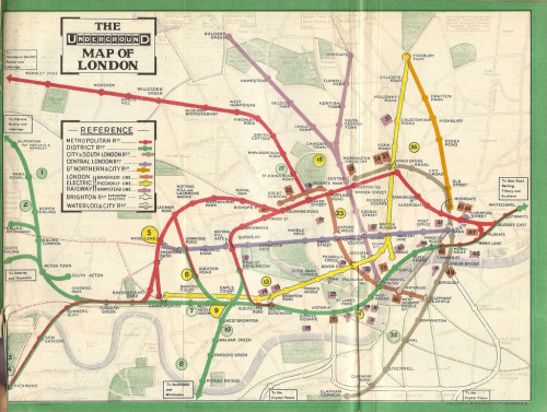
npr:theoinglis:The Evolution of the London Underground Map;Above left to right - 1908, 1908, 1910, 1
npr:theoinglis:The Evolution of the London Underground Map;Above left to right - 1908, 1908, 1910, 1911, 1927, 1933, 1937 and the present day. (Old maps are from here)Before the development of the iconic diagram style map in 1931 the tube map was constantly changing, never sticking to a consistent style. Some maps showed what was going on overground too and most of them attempt to be geographically correct, showing the curves and turns of the lines. By 1927 the map has become much clearer and easier to follow. The problem was that the train lines were getting longer and this made it impossible to fit everything into one map. Keeping it geographically accurate would have meant that the centre became smaller and harder to read, and the centre is the most densely packed and most important part. In comes Harry Beck in 1931, inspired by electronic circuit diagrams he had the idea of scrapping geographical accuracy and making all lines straight with only 45 and 90 degree angles. Design history was made and the map has barely changed since, becoming an icon and one of the easiest to use maps in the world!Interestingly some people think the map should be more geographically correct once again, have a look at this article for more on that. Personally I dont think the tube map needs changing. But if they could include a seperate geographically correct version of the centre of London on the pocket tube map, people would see how close some stations are together and it would encourage walking. But the map itself, isn’t broke so why fix it! You just gotta love London, right? —Wright -- source link
Tumblr Blog : theoinglis.tumblr.com
#london#london underground#tube map#cartography#design#graphic design#history#london map#maps#tube#underground#mapping#location#visualization#infographics


