Bold Colour or Gentle Lines: The illustrations and other assets that I had already made were easily
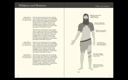
Bold Colour or Gentle Lines: The illustrations and other assets that I had already made were easily transferrable to the new, more scientific visual style that I had developed, and firstly I simply substituted the browns, blues and purples for a selection of monochrome greys, whites and blacks. Partnered with the Multiply blending option, the yellow of the paper bled through; I liked the way this looked, as it was reminiscent of the old and tattered scientific documents that I had previously researched. However, along with the bold header at the top, the grey illustrations make the page look congested and dirty. I then tried a different approach; I changed the illustrations and the header at the top of the page to lines. That way, both were still clear graphical assets but didn’t make the spread (and the overall book) feel as heavy, also by doing this, both assets seemed to work better within the scientific visual style. -- source link
Tumblr Blog : overonehundred-blog.tumblr.com
#vcm650#visual communication#visual#stroke#illustration#illustrative#illustrator#science#scientific#detail#graphic#graphic design#design#designed#designer#diagram

