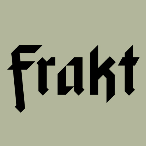
In working on this Werner Herzog package I knew I wanted to incorporate a fraktur typeface for displ
In working on this Werner Herzog package I knew I wanted to incorporate a fraktur typeface for display and headline purposes. However, I wanted the package design to be clean, modern, and efficient. All the things fraktur faces are not. Putting the ornate letterforms in contrast with the stripped-down modern layout wasn’t an option for this project. Having accepted that, my only recourse was to create something from scratch. I started with HERZOG and over time built out the remaining face from there. Unfortunately, mixing anything remotely gothic looking and the word Herzog tends to become a metal band logo. And I’m sure that band is shredding in someone’s garage right now. Because of this and other design considerations, the face didn’t get used on the final package. -- source link
Tumblr Blog : f-davis.tumblr.com
#herzog#typographydesign#typedesign#typography#fraktur


