transitmaps:typeworship:Happy Birthday Johnston and the London UndergroundThis week London sees the
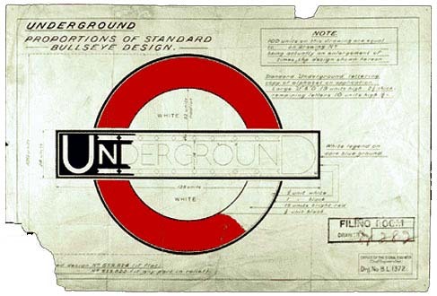
transitmaps:typeworship:Happy Birthday Johnston and the London UndergroundThis week London sees the 150th anniversary of the London Underground. To commemorate the occasion a stream locomotive used in the 19th century made a journey through the modern tunnels of the Metropolitan line. See more on the BBCIt is also 100 years since its iconic typeface Johnston Sans was released as the the ‘Underground’ typeface. Dan Rhatigan, type director at Monotype and forthcoming interviewee of 8 Faces talks about Edward Johnston and the typeface here. The structured, based on a calligraphic nib held at a 45 degree angle, is emphasised by Johnston’s diamond tittles shapes (the dots over the i and j), one of it’s most recognisable characteristics.That drawing for the old London Underground roundel (or “bullseye” as they called it then) is just beautiful. I’m a little divided about Johnston Sans itself: while it’s a distinctive and integral part of the Underground’s identity, it’s not a very versatile font and is pretty wide, taking up a lot of space, even for something simple like station labels on the tube map. -- source link
Tumblr Blog : blog.8faces.com


