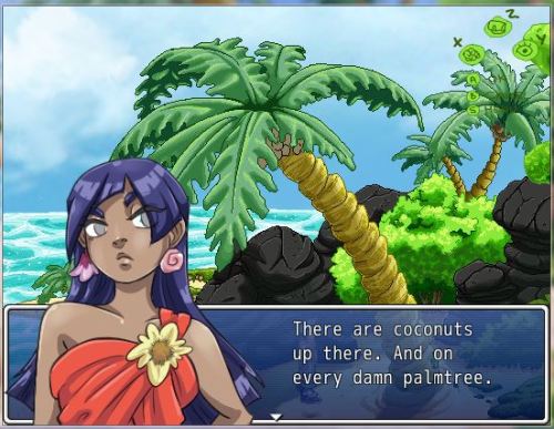
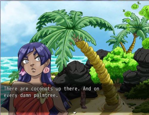
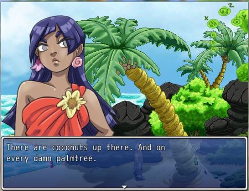
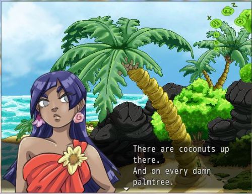
siklogame:Experimenting with bust style and position. I’m not sure which option to go with,
siklogame: Experimenting with bust style and position. I’m not sure which option to go with, I do admit I only now thought about changing this stuff. Also now I’m contemplating if I should ditch the pixel style for the maps and try a painterly/tribal look, same with the busts, instead of cell-shading. Would be so much work but it could look really awesome if I could add textures. As usual, feel free to comment and give your opinions! ? I like the top one. I like being able to see the outfit, and the border around the dialogue box makes it so that it doesn’t blend into the background. However, the front portrait also has it that your dialogue is squished/can’t fit as many text.The one with the bust on top and the bordered box below it is also nice, though I think having the rest of her body under it would be a nicer addition. However, if you have characters with height differences, that may be hard to do. So maybe having MC behind it like the second one may be better?Tough decisions @A@;;;! -- source link
Tumblr Blog : siklogame-blog.tumblr.com
#rpg maker


