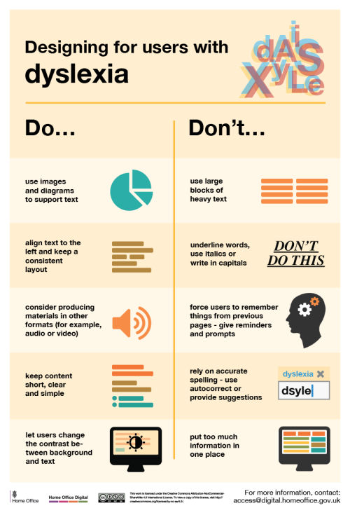
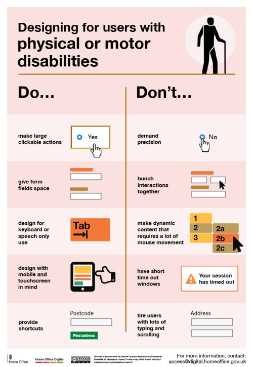
decodering:Dos and don'ts on designing for accessibilityKarwai Pun, GOV.UK:The dos and don’ts of des
decodering:Dos and don'ts on designing for accessibilityKarwai Pun, GOV.UK:The dos and don’ts of designing for accessibility are general guidelines, best design practices for making services accessible in government. Currently, there are six different posters in the series that cater to users from these areas: low vision, D/deaf and hard of hearing, dyslexia, motor disabilities, users on the autistic spectrum and users of screen readers.[…] Another aim of the posters is that they’re meant to be general guidance as opposed to being overly prescriptive. Using bright contrast was advised for some (such as those with low vision) although some users on the autistic spectrum would prefer differently. Where advice seems contradictory, it’s always worth testing your designs with users to find the right balance, making compromises that best suit the users’ needs.[github]Image descriptions are at the link. -- source link
#access#accessibility


