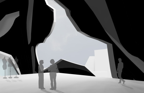
artbygabialvergue: Comme des Garçons Flagship Boutique and Exhibition GalleryAoyama, Tokyo, JapanDSG
artbygabialvergue: Comme des Garçons Flagship Boutique and Exhibition GalleryAoyama, Tokyo, JapanDSGN 225 - Architectural Fundamentals III // Spring 2015 //Gabriela Cloe AlvergueThis high end boutique’ massing consists of hard edges blending against curves in order to create a distinct profile and use of figuration. In order to represent Comme des Garçons’ distinct style, the articulation in the outer layer of the objects is represented using the idea of Japanese graphics and was based off Hiragana lettering (one of the three lettering types in Japanese). In order to represent the idea of the three part based composition, the articulation differs from each other in each of the objects. The articulation for this destroys the lettering, and stretches into a linear three dimensional pattern. Overall, this project plays with the idea of being nestled in a small space to truly connect with the garments and accessories, and connecting with individuals in large strange environments in an abrupt transition.Comme des Garçons plays with the idea of distorting the human anatomy and using garments in an unconventional manner. This idea was portrayed in this building by using object oriented ontology. A garment in the S/S 2015 Collection by the company was interesting for its distinction with three parts using different textures and textiles in order to make this distinction. This idea was represented in the project with its massing and articulation differences. The idea of playing with sharp angles and curves were used when developing the morphology. Projects like the New Keerlung Harbor by Maxi Spina Architecture, and Karostas’ Objects Orientated Artifacts by Moksud Khan both include these characteristics and interplay with graphics for its articulation.Being based in Tokyo, Comme des Garçons is exposed to Tokyo’s distinct graphics and patterns. This idea of representing the Japanese culture with their expressive designs in the articulation was a must. In addition, even though it is unknown what Rei Kawakubo meant with “Comme Des Garcons”, “like boys” brings the idea that her garments stray from the woman figure. The relation to Hiragana lettering can be made to this as well. Hiragana was once only used by women and often is referred to as “woman’s hand”. This typography is mainly used today in children literature and graphic books. This idea relates to the graphic aspects of the company, and how Rei Kawakubo started with womenswear. In brief, precedents in fashion, architecture, and Japanese culture were crucial to make a clear understanding of the company’ upbringings. Object Oriented Ontology is especially relevant in fashion today. Comme des Garçons broke away from making garments like any other company out there. So why should the company use classical architecture to represent its brand? -- source link
Tumblr Blog : artbygabialvergue-blog.tumblr.com
#architectureschool#architecture#fashion#rei kawakubo#aoyama#hiragana#archstudent#rhinoceros#saynotorevit


