BLACK KILLINGS BY POLICE: Maps of relative rates of Black fatalitiesBased on a large dataset of poli
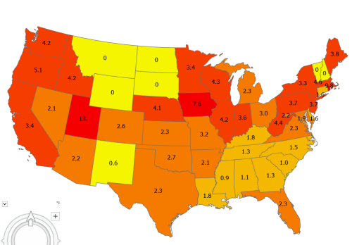
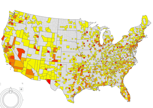
BLACK KILLINGS BY POLICE: Maps of relative rates of Black fatalitiesBased on a large dataset of police killings (including cases from 2015 through Sept. 24, 2020), these maps show the percentage of killings by police in which the fatalities were black, normalized by the percentage of the total population that is Black. The total fatality count in that time period, of all races, is about 5,600 people. So values greater than 1 represent disproportionate risk to Black people. Data courtesy of Washington Post reporters, who share their data on GitHub. Maps by Professor Cunningham of the Vassar College GIS Lab.Note the patterns: states with high rates of black killings by police, not surprisingly, largely coincide with those known for BLM activism and protests. There are some possible surprises for the highest rates by states: Utah (13), Iowa (7.6), Oregon (5.1), West Virginia (4.4), Wisconsin (4.3), Illinois (4.2), Idaho (4.2), and Washington (4.2). Note that much of the South and Midwest has relatively low rates. The data per county do not correspond with a strict rural-urban breakdown, but is quite irregular. It probably reflects local police-black community relations, which apparently vary widely.Data source: Washington Post, Police Shootings data. Research and reporting by Julie Tate, Jennifer Jenkins and Steven Rich. Database development: John Muyskenshttps://github.com/washingtonpost/data-police-shootings -- source link
Tumblr Blog : urbangeographies.tumblr.com
#police#black fatalities#police shootings#highlight#washington post#favorites

