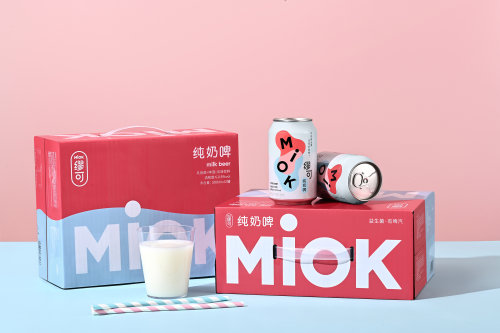
thedsgnblog: MIOK Milk Beer Packaging by IBEA DesignMiok is a milk beer brand that started in Hangzh
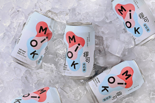
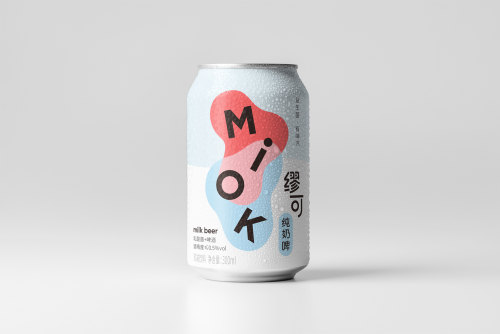
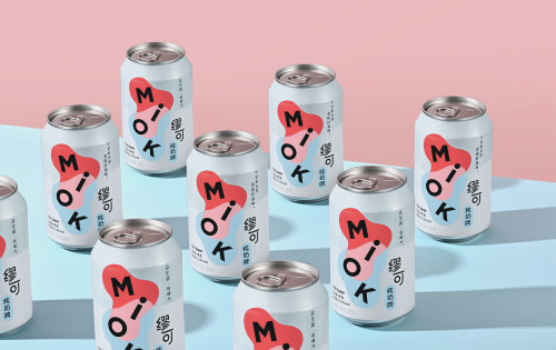
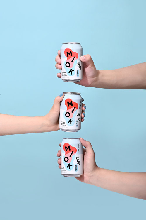
thedsgnblog: MIOK Milk Beer Packaging by IBEA DesignMiok is a milk beer brand that started in Hangzhou, China, in 2021. It explores the fun of mixing milk and beer, which creates this new combination of sweet and sour milk with tasty beer bubbles. It has abundant probiotics but low alcohol content. As a new kind of beverage brand, Miok wants to be adventurous, creative, and joyful. The concept of Miok’s brand identity is “Mixing.” Around the floating Miok letters, two liquid shapes are mixing into a new shape—the visual is bold, dynamic, and joyful representing the beverage’s unique characteristics. The logo is the main visual element on the product packaging to ensure this new brand is eye-catching and memorable in the market.Consumers can buy Miok both online and in-store, so the packaging system includes gift boxes, shipping boxes, and portable boxes for different usages. The campaign design also includes online store design and offline activity design. Brand Strategy & Design / Iris FanChinese Logotype / Bei GuPhotography & Video / Hejun ZhangPackaging Execution / Fan FanMotion Graphic Editing / Wenhui GaoTDB: instagram • twitter • facebook • newsletter • pinterest -- source link
Tumblr Blog : thedsgnblog.com
#thedesignblog#design#graphicdesign#packaging#package#packaging design#typography#print design#branding
