b&r no.1d.b. updike’s advice on acquisition of material for a printing office: &l
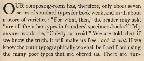
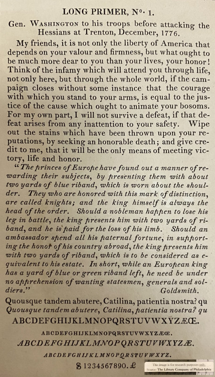
b&r no.1d.b. updike’s advice on acquisition of material for a printing office: «A third type (which originated with Binny & Ronaldson of Philadelphia over a hundred years ago) is in design transitional between old style and modern face. For books where the old-fashioned air of Caslon would be to obtrusive, and yet which call for a letter more interesting in design than the somewhat bald Scotch face, there is nothing better. I should not advise the purchase of this transitional series at the expense of the first two types chosen, but it will frequently do the work of either. … It is called ‘Oxford’ by the American Type Founders Company, from whom it may be had. I have used it for this book [first illustration]. It seems to me a type of real distinction.» [Printing Types, 2nd ed., vol ii, oup, 1937, p231]. a.f. johnson confirms: «The roman which Updike used for the text of his Printing Types, called ‘Oxford’ and originally cut by Binny and Ronaldson of Philadelphia, seems to have some affinity with Austin’s¹.» [Type Designs, grafton & co., london, 1959, p74]. in the same year as the 1892 merger that constituted the american type founders company [atf], joseph warren phinney, atf vice-president & former partner in one of atf’s original constituents, the dickinson foundry of boston, advocated revival of the b&r no.1: repaired & augmented with additional sorts, b&r no.1 was reissued as atf «oxford» (but what has this face to do with oxford—presumably the university? ² ). «oxford» is not shown in atf specimen books of 1897 or 1923 (nor do i find b&r no.1 material in the huge mackellar, smiths & jordan book of 1892 ³), but was available for special order into the 1960s. the atf oxford matrices (what of binny’s punches?) now repose in the smithsonian institution. in 1946, in order to provide historically allusive faces for planned publication of The Papers of Thomas Jefferson [princeton unversity press, 1950], p.j. conkwright, then art director of the princeton university press, advocated adaptation of atf oxford for the linotype; c.h. griffith, then a vp at mergenthaler linotype, designed a b&r no.1 revival: linotype monticello, named in reference to the publication of its first showing. in 2003 linotype issued a digital version of monticello, based not upon the earlier linotype revival but on matthew carter’s redrawing, afresh from the atf oxford material [cf. ‹Monticello Typeface›]. for an allusive composition set in monticello vide ‹perdita›.1st illustration: excerpted from Printing Types [updike, op. cit., p241]; oxford types.2nd illustration [iphone photo]: showing of long primer no.1 roman & italic [Specimen of Printing Type, from the Letter Foundry of James Ronaldson, successor to Binny & Ronaldson. | Cedar, between Ninth and Tenth streets, | Philadelphia. | 1822. [Am 1822 Ron 17455.O.1]. for the largest size of no.1, long primer, binny cut a variant, more cursive, italic p; & note the dollar sign—binny was the first to engrave this famous symbol.with thanks to the library company of philadelphia for permitting my examination of their extremely rare binny & ronaldson material.⎯⎯⎯⎯⎯⎯¹ johnson refers to the types cut by richard austin of london for london publishing pioneer john bell—vide ‹the letters of john bell›. the roman also shares affinity with baskerville’s—e.g. unclosed loop or bowl of g. updike affirms bell’s type but has no knowledge of bell: «The two upper sections in our plate (fig. 367) are set in a transitional font, which is, both in roman and italic, a fine and workable letter.» [updike, op. cit., p.243].² latterly i discovered, harry carter posed the same question in his review of The Specimen Books of Binny and Ronaldson, 1809-1812, in facsimile [introduction c. c. rollins, the columbiad club, connecticut, 1936] in The Library [volume s4-xviii, issue 1, june 1937, p118].³ original no.1 material still appeared in the 1853 specimen book of l. johnson & co., successor of richard ronaldson: the title-page, however, presents an anomaly—‘on the base of Sower’s Foundry of 1737’. apparently incorrect for christopher sower 1st had only imported his foundry from germany in 1772. i cannot find anywhere that sower material descended to binny & ronaldson [✓]; in particular, the foundry of christopher 2nd was worked by a german, justus fox, who fortuitously came into possession after the revolution due to disenfranchisement of christopher 2nd in consequence of previous affinities, & fox later purchased outright; de vinne reports «In 1806 Fox’s son [emanuel] sold the foundry to Samual Sower, son of Christopher Sauer 2nd [his 8th child], who had previously tried to establish a type-foundry at Baltimore, which attempt was renewed by him in 1815.» [de vinne, op. cit., p100]. thus sower family material reunited in the foundry that eventually evolved into The Baltimore Type Foundry, & which descended to be a constituent of the 1892 atf merger. -- source link
Tumblr Blog : duardius.tumblr.com
#typography#binny ronaldson#linotype#ch griffith#pj conkwright

