jenson’s rotundafirst illustrated is a setting of alfred forbes johnson’s statement rega
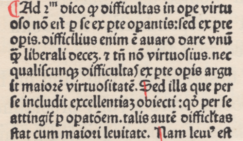
jenson’s rotundafirst illustrated is a setting of alfred forbes johnson’s statement regarding nicolas jenson’s rotundas, from his Type Designs [3rd ed., andre deutsch, london, 166, p17]. johnson capitalised Rotunda but not roman: for systematic capitalisation & to improve setting color i have set both lower-case. set in bruce roger’s centaur, roger’s neo-venetian homage to jenson. for more on centaur vide ‹livius andronicus›. line finisher is digital reissue of monotype’s recutting of «Granjon’s flower on Bourgeois» (1558) [cf. hendrik d. l. vervliet, Granjon’s flowers, oak knoll press, new castle (del), 2016, p61].second illustration is facsimile of the final page from the Super Tertio Sententiarum of john duns scouts [johannis de colonia & nicolai iençon, venice, 1481]; plate 17 in theodore low de vinne’s Notable Printers of Italy during the Fifteenth Century [the grolier club, new york, 1910, p77]. the page is set in one of jenson’s small rotundas & concludes with colophon¹ & jenson’s device. «The type of the text is a Black-letter on 10 point body that may be accepted as a design approved by Jenson even if all punches were not cut by his own hand.» [ibid., p76]. the third illustration shows enlarged section of composition. i am amazed that there has been no digital revival of a jenson rotunda!¹ translation given by de vinne: «Printed at Venice by the order and at the expense of John of Cologne, Nicolas Jenson & Company. In the year of our Lord fourteen hundred and eighty one. To God the praise.» [A Treatise on Title-pages, the century co., new york, 1902, p24]. -- source link
Tumblr Blog : duardius.tumblr.com
#typography#venetian#rotunda#nicolas jenson


