palemona:Back to the classics - a retro theme by palemonapreview 1 | preview 2 | codeHey there it&rs
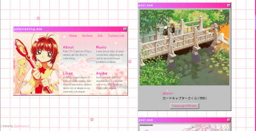
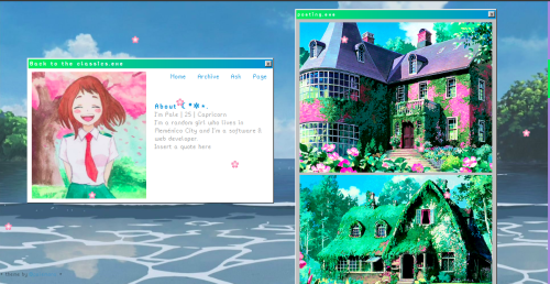
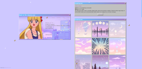
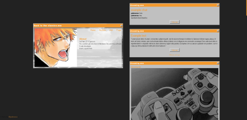
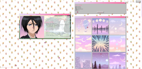
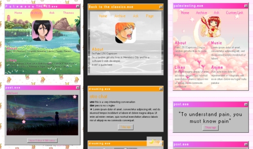
palemona:Back to the classics - a retro theme by palemonapreview 1 | preview 2 | codeHey there it’s been a while, a long time ago I wanted to do something with 90′s/early 2000′s internet vibes, so here is it. This theme it’s suupeeeer customizable, so let’s get crazy.General Features: RESPONSIVE: looks good in big screens, small laptops and even in cellphones :3Custom Background: it can be an image or color, and you can change the repeat behaviour, position and size of the background.Custom theme colors: You can choose 2 colors that will be the primary colors of the theme.Enable Grayscale effect on images Choose between 3 fonts, 2 pixelated and one sans-sarif.Change font sizeChange the default tittle of the windows (and it can be empty too)Show tags if you wantCustom pagination icon (preference to be an emoji :3)Snowing emoji effect (you can disable it too, and it can be words too if you want)1 custom link Link for pages are shown in the menu automatically if you want tooDisable/Enable AskGo to top buttonNice effect on menu links (a ▶ will appear if the cursor is over it, you can disable it too) Main Card FeaturesResponsive: it will resize depending on how much text you add (and it has a 700px x 400px limit, if you add to much text the scroll bar will be enabled)2 Mini Layouts Options: You can choose between two layouts, grid mode for 1 to 4 mini sections and the simple card mode, for 1 to 2 mini sections.Custom Background: it can be and image or color, and you can change the repeat behaviour and size of the background.Portrait Image for Card: it will adjust to the height of the card automatically, so you don’t have to worry for the sizes, even if you upload a landscape image it will be cuted automatically to fit :3 Change the color and size of the text.Option to add a “transparent layer” if your background image it’s too colorfull and the text isn’t too legibleNotesIf you don’t add a card image the space will remain emptyIn mobile version, the image will be cut in a square with rounded bordersIf you want to enable de mobile version, you have to go to advanced options of the theme and disable the option “use default mobile theme”The grayscale option will also affect the images on the card.If you want more custom links please message me and i will find the way to add them XDIf something it’s buggy please send me a messageI think that this would be a nice about page too, if you like the idea please reblog and I will do the adaptation for an About Page :3Hope you like it! It all came with a “personal card” I wanted to do for my profile on everskies.com XD The main idea was to create an about you card simulating a little retro website/program. I recommend adding a pixel or anime scenery for the background image card, that was the whole original idea. Sorry for the spam of images, but I really wanted to show all the layouts you can make, aesthetic, anime, kawaii, minimalist, etc. If you like it please reblog! :3 remember it’s freeeee. -- source link
Tumblr Blog : palemona.tumblr.com
#hell yeah
