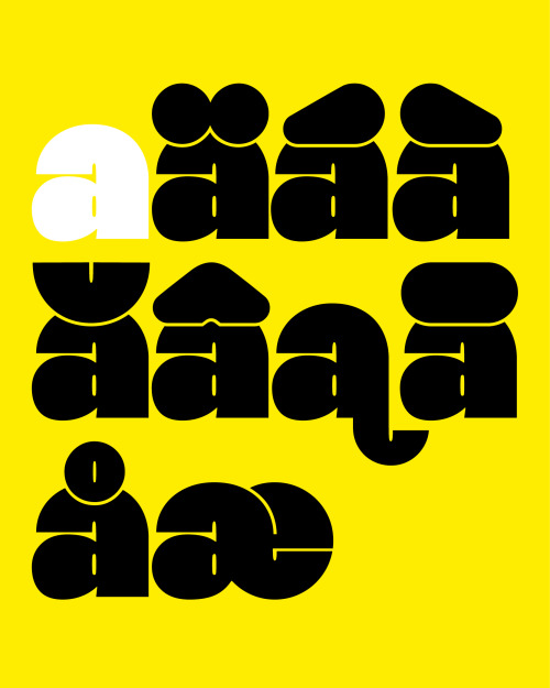
One of Hanje’s distinctive features is its massive diacritics. Instead of just sitting on top
One of Hanje’s distinctive features is its massive diacritics. Instead of just sitting on top of the letters, a gap between letter and diacritic is manually carved out. The fact that the diacritics don’t sit on top, a small line height is possible without letters colliding. This helps the typeface remain its dense and heavy construction as well as tight letter spacing.While in some typefaces diacritics appear as more of an indulgence, they are where Hanje’s strength and part of its personality lie. Therefore the typeface is very strong in languages where many diacritics occur.www.new-letters.de -- source link
Tumblr Blog : new-letters.tumblr.com
#typeface#release#ultraheavy#thomasjohn#display#typography#typefoundry#newletters#tomorrowfeatured#type01#lavendrtype#typedepartment#typegoodness#typespire#designfeed#thedod#typetype#365typefaces#aigadesign#eyeondesign#itsnicethat#designeverywhere

