Part 2/6 - Adapting a Classic (Style) Part 1 - The Family | 3 - The
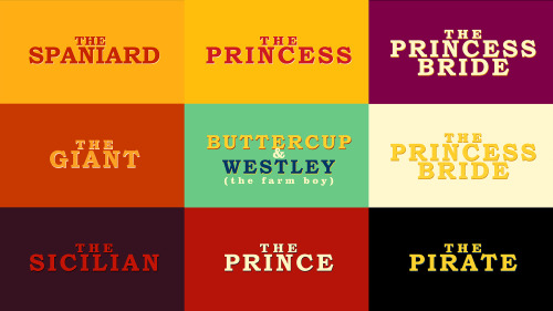
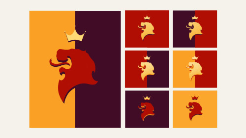
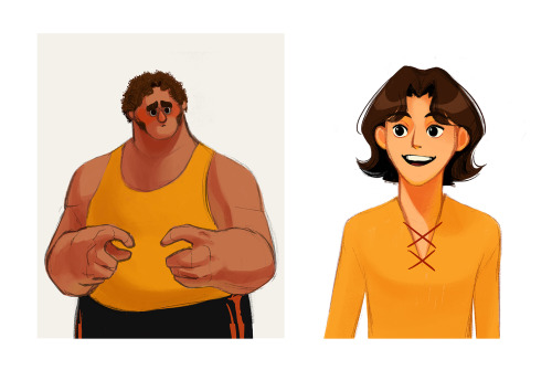
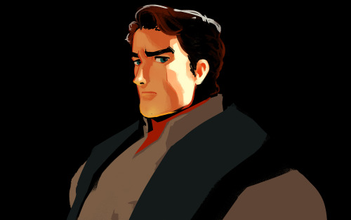
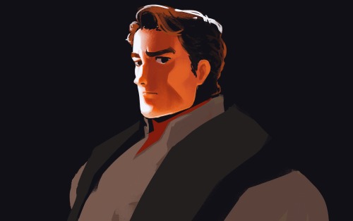
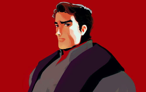
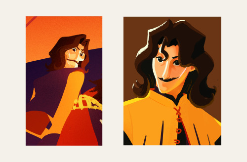
Part 2/6 - Adapting a Classic (Style) Part 1 - The Family | 3 - The Sicilian Assassins | 4 - Buttercup and Westley | 5 - The Prince and the Count | 6 - Florin CastleOne of the ideas behind this project was about bridging the gap between the old and the new. I wanted to express the vibrance and colourful quality of a medieval (nearing renaissance) setting while using contemporary techniques, to appeal to a modern audience, with a nostalgic undertone.Adding some browns to the palette also helped pushed it towards that slightly nostalgic direction. I shifted the other colours slightly, like using mustard or yellow-orange instead of just yellow, vermillion instead of just orange, and throwing in some violets, all to add that dash of quirky-ness to reflect the fun and witty tone of both the movie and the book.Another idea is that this version would be a series. This gives us time and opportunity to see and experience the characters’ past, like in the book.I was figuring out how light would interact with the characters while pushing the role of line. I did studies on how to make a line express form, colour, and light. From afar, the line can be reflected light, but up close the “line” expressing reflected light would spread in a stylized manner. This creates the feeling of an increase of detail when we look at something up close all while strengthening the colourful quality of the project throughout. -- source link
Tumblr Blog : 1bjavier.tumblr.com
#visdev#visual development#colour#graphic design#colour studies#medieval#fezzik#florin
