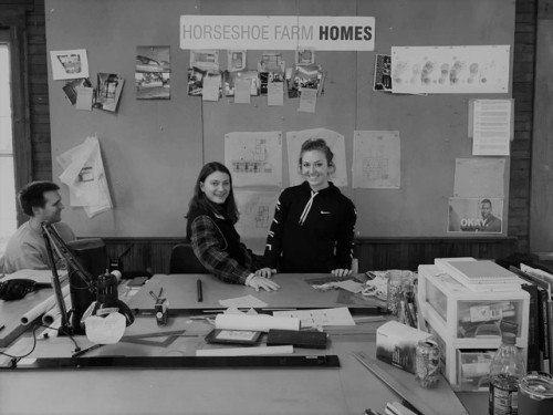
What a productive week! From Monday to Friday, the Horseshoe Home Team worked on design charrettes.
What a productive week! From Monday to Friday, the Horseshoe Home Team worked on design charrettes. We aim to create a stable and positive atmosphere for six women who are aging in isolation, living with mental illness, or overcoming trauma. Our goal is to create a design that accommodates and promotes physical, mental, and emotional wellness!We developed minimal unit plans based on universal design. Universal design is defined as the design and composition of an environment so that it can be accessed, understood, and used to the greatest extent possible by all people regardless of their age, size, ability, or disability. This means going beyond ADA and code requirements to create a space that is accessible in all ways, but doesn’t “look” contrived. In fact, a criteria of universal design is that is be beautiful. So, we developed and named these four unit plans after our friends at the existing South Street home. Barbara, Maureen, Christina, and Artemis. Barbara’s scheme separates the front of the unit for bathroom and kitchen from the back bedroom. A core storage wall and desk space mediates the two zones. Maureen focuses on pulling natural light into the unit, with a light well in the bathroom and a unit shape that can be easily aggregated. Christina tucks all utility into an interlocking core, so that the bedroom feels private and self-contained. Artemis is a deep and narrow plan with a direct circulatory path from front to back door. A bar of utility allows the bathroom and kitchen to share a sink, and the toilet and shower to be concealed behind a sliding partition door until needed.In addition, we are designing from the general to the specific by creating massing site plans. These we also developed and named. Cleo features six small apartment-like pods that share diverse interstitial outdoor spaces. Gert collects six units in a linear scheme with a detached, floating community space. This scheme welcomes both the new and current residents alike. Phyllis laid out the units with personal back porches and a large shared front yard. It extends the public bar from the existing house and surrounds it with porch space. Linda placed the new units to the street front for a strong site presence, creating a massive private back yard. On Friday afternoon we pinned all of these charrettes in front of the famous Brit, Andrew Freear, hot off the Harvard press. We discussed the pros and cons of each scheme, and even tossed around the idea of a Frankenstein model - pairing a unit plan with a site plan. Additional takeaways from the review:Open up the unit plan for flexibility of furniture arrangements and personalizing space to allow home-making (emotional benefits). If planned properly, wet walls can be shared between units, and one sink can serve both a bedroom and kitchen for a unit sized 200 sf (spatial efficiency). Natural light must be prioritized for its positive effects on future inhabitants (mental benefits.) Units and community space will be equally accessible and desirable (physical and operational benefits).We look forward to reacting to the critique in the coming days! -- source link
Tumblr Blog : horseshoehomes.tumblr.com
#ruralstudio horseshoehome


