petermorwood: drst:arrghigiveup:TiL (click to go to the thread, which probably has more int
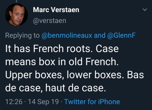
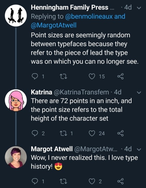
petermorwood: drst: arrghigiveup: TiL (click to go to the thread, which probably has more interesting tidbits I missed). Bonus: These are my people. Betting I’ve reblogged this before. Betting I’ll reblog it when it turns up again. In addition to the print terminology stuff: the visual shorthand icons and ad graphics for something about writing are still often pen-nibs, fountain pens and typewriters… …while graphics of a monitor, keyboard and mouse remain visual shorthand for computing… …even though most writers now use monitor / keyboard / mouse or even laptop / touchpad. In addition, headers for “this blog / website is about writing” are often in one of the many imitation typewriter fonts complete with smudges, or just Courier. The start and end call icons on most / all smartphones is still the handset of a classic desk telephone, and sometimes the open-app icon is a complete phone. The term “hang up” for “end the call” refers to something even older - one of these… And of course the Save icon is indeed a 3½ inch floppy disc. Why it wasn’t a 5¼ floppy is a mystery. The icon version is just as distinctive. Also, why various OP updates never changed “Save” to the graphic of a CD / DVD or flash drive is another mystery, and nowadays a Save icon should probably be a cartoon cloud. Graphics and terminology are funny things. -- source link
Tumblr Blog : arrghigiveup.tumblr.com


