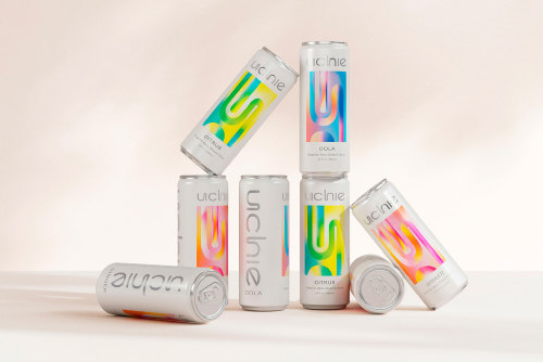
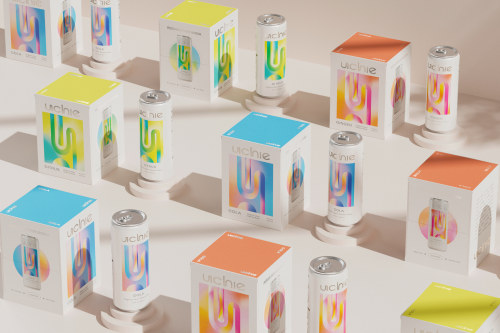
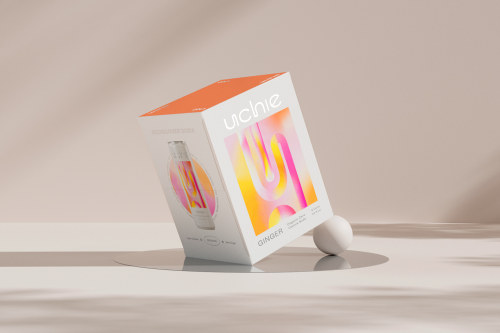
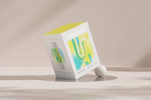
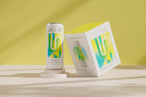
Uchie Packaging by Kati FornerUchie came to us to help former pop lovers rediscover the joys of soda
Uchie Packaging by Kati FornerUchie came to us to help former pop lovers rediscover the joys of soda in a healthier form—with zero calories, no sugar, all-organic ingredients, natural sweetness and no shame. We positioned Uchie as the soda for who you are now, so you can treat yourself, and still treat yourself right.Leaving out trendy add-ons in favor of flavor focus, Uchie innovates in a tasteful, and tasty, way to simply bring us more of what we love and none of what we don’t. Which led us to the perfect tongue-and-cheek tagline “Very Tasteful.” Inspired by the art of the Light and Space Movement, we gave the brand a visionary graphic palette that spoke to innovation and artfulness.The logomark feels clean, inviting and playful with an innovative twist. Contrasting type pairings bring bold personality and presence to the identity. An unexpected palette brings a dynamic, modern feel to timeless colors, elevated by future-forward silver. (KF for dieline.com)TDB: instagram • twitter • facebook • newsletter • pinterest -- source link
Tumblr Blog : thedsgnblog.com
#thedsgnblog#design#packaging#graphic design#branding#identity#logo design#gradients#kati forner#packaging design

